Shopify Expert Insights

E-Com Advice from our experienced in-house team


This year we made a Christmas card for our clients and friends that could be turned in to a simple paper-craft Christmas tree.

Some recipients were kind enough to send us photos of their trees–


If you as an individual want to write an email to your family, what would you do? I would open Gmail and compose a letter to my family. Maybe I would add a picture as an attachment.

If your brand wants to send an email to its customers, what happens? A graphic email is designed, content is forced in to it, it's cut & coded in non-semantic HTML, and then distributed to a mail list. Upon arrival, the images don't load because they're probably disabled by default, and your table layout breaks because email clients don't support web standards.

Email clients don't support web standards because they're not web browsers. Microsoft goes so far as using Word as Outlook's rendering engine. That makes sense: email is correspondence, not interactive media. That's why we prefer plain text emails for our newsletter. It looks more personal, and has a 4-7% higher click-through rate.

Stop trying to shoe-horn your branding design guidelines in to your emails, and start communicating with your customers instead.
In addition to web standards, we have our own pro-tips and best practices that our developers follow.

When writing HTML...
Be semantic above all else
Separate style from content
Make use of form features such as fieldset, legend, label, and input[type=email]
Use divs sparingly. Instead use HTML5 tags such as header, footer, nav, section, article, and aside.
Limit H1 tags to one per separate content level. For example, an overall page can have one as a title, and each article should have one.

When writing CSS...
Use repeated patterns to keep CSS lean
Only use !important when absolutely necessary.
Use IDs for unique elements
Use classes are for repeated patterns
Use in-line styles only in the rare circumstance where it results in a smaller overall page size
Alphabetize styles first, then group according to function, browser specific/partially supported styles at end. For position, margin, padding: x, y, then z. For background-position: horizontal then vertical.

Example:
        #minky {
            background: #000100;
            border: 1px #0f0 solid;
            color: #fefcff;
            margin: 0; padding: 0;
            position: absolute; top: 5px; left: 10px;
          
            -webkit-border-radius: 12px;
            -moz-border-radius: 12px;
            border-radius: 12px;
        }

By following coding best practices, we create code and websites that are useful to people, understood by machines, and easily maintained by developers. This improves usability, accessibility, SEO, and reduces maintenance cost.
On Friday, December 9th, Ethercycle joined nearly 100 bicyclists at Amlings Cycle & Fitness in Niles, IL to travel 12 miles to Mystic Celt in Chicago where we donated 1,000 toys to the U.S. Marine Corps Toys for Tots Program.

“While bicycle riding isn’t typically thought of as a winter sport, the ride is a great way to get some exercise, fresh air and most importantly to ensure all children have a wonderful holiday. There’s nothing like a new toy to brighten a child’s holiday especially in these tough economic times when many families are struggling to make ends meet.” sasys Joe Reichert, owner of Amlings Cycle & Fitness.


More information can be found at www.toyridechicago.com
When we designed the 9th Annual Toy Ride website, we knew our registration form would directly impact rider attendance. Through split-testing, we were able to optimize the form right up until the crucial last week before the ride when most participants sign up. It was a success, and the Toy Ride had a record number of registrations and riders.


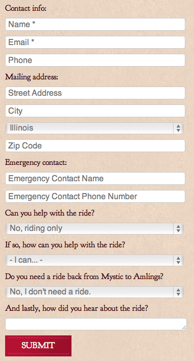
Here's what we learned works when designing a form to convert:

Group related items into sections. We used section labels to group "contact info" and "mailing address." Cognitively, it makes the form seem shorter than when it's just a list of fields.

Use left aligned top labels to streamline the visual path.

Use simple labels for common fields. For example, just label a phone number field "Phone" instead of something cute like "Can I get your digits?"

Use self-explanatory questions and answers for uncommon items. While "phone" is self-explanatory, asking if someone can volunteer at the event was not. In those cases, it's best to pose a question in plain language. We asked our users, "Can you help with the ride?"

Left align the submit button to line up with labels and fields. From top to bottom, this creates a single visual path.

Use common labels for buttons such as submit, send, or buy.

Indicate required fields with an asterisk.

Only make required the fields that are actually necessary. (For an impatient user, we only required the bare minimum to contact them: name and email. The other information would be requested at the event.)

Pre-select common responses. (Since the ride was in Chicago, we pre-selected "Illinois" for the state field.)

Inline labels can visually de-clutter a long form but they can also pose a usability problem as the label disappears on click. They should only be used in common fields and where their context gives a clue to the input.

Ultimately, the key to making anything work better is to make it easier. Whether it's a form or a smart phone, if you want people to use it, make it easy. While moving a button from right-aligned to left-aligned may seem trivial, it's another detail that can mean the difference between a user who converts and a user who bounces. When designing forms, remember the KISS principle: Keep it simple, Stupid!


The Herman Cain campaign added a new section to their website called Women for Cain. Unfortunately, this carefully diverse group of women is actually just a stock photo entitled "Four happy young women (holding their thumbs up)" by German photographer Robert Kneschke.


You too can license the Women for Cain on Shutterstock for only $19. Being a stock photo, other people already have licensed the Women for Cain:


The problem with stock photos is that they're disingenuous. The photo featured on Cain's website implies that those four women with their insipid smiles are endorsing Cain, when in reality they were German models who had no notion as to what purposes their eager thumbs up would serve.

Instead of falling back on stock photos, Women for Cain could have taken the time to have professional photos taken of their supporters. Or, if budget or time was a constraint, they could have used a strong typographical logo. There's no need in the design to literally show a group of women giving an endorsement, the content and title of the site already do that.
After spending Thanksgiving with our families, we visited our local big box retailers to get a feel for consumer confidence this holiday season. Surprisingly, most stores had no lines. We felt the new midnight doorbuster sales would draw more people. In fact, only Best Buy had customers lining up.

 
This family of six had been in line for 38 hours.


Late comers to the fray. One man had all of the local Black Friday deals memorized and was instructing people on where to go for the most savings on particular items.


These gentlemen had arrived at 7am on Thanksgiving, making them 12th & 13th in line, to purchase a new TV.


A group of kids on BMX bikes who, like us, had ridden by to see the crowds.


This man planned to buy as many deal items as he could with the intention of reselling them on eBay.

With the unusually few people we saw in stores, we believe that online sales will be more critical than ever. For the first time, so-called big box Cyber Monday deals are just as attractive as their Black Friday brick & mortar counterparts. We've also seen online-only retailers break rank and begin their sales on the Monday before Black Friday as opposed to after. 

Given how frequently doorbuster sales (so named because shoppers literally break the store's doors) can turn tragic, we hope the shift toward online sales continues.
If your HTML is strictly a semantic layout of your content, then you can always change your presentation with CSS and JavaScript. Semantic HTML is intentionally simple. At a glance, one needs only a basic knowledge of HTML elements to understand your content. This keeps pages light, machine-friendly, and easy to maintain.

By being machine-friendly we improve accessibility and SEO. First, universal access devices such as blind readers allow your content to be used by impaired individuals. Second, Google's spiders are able to better understand the intent of your site through semantic markup.

The process is as simple as separating style from substance. The HTML elements tell you their intended use. For examples, tables should only be used to display tabular data, and never to lay out a site. Let's take a look at the EtherCycle process page:


Because the process page is a list of steps with explanations, we've defined it as a definition list with each step being a term and the explanation being the definition. Take a peek at the code–


Learn


It is fundamental to a project's success that we understand your business. We do this by auditing your content, interviewing key stakeholders & customers, reviewing analytics data, and listening to you.


All the styling (including the images) are done in CSS3 using selectors–

#process {
    counter-reset: toc 0;
}
#process dt:before {
    content: counter(toc, decimal) ". ";
    counter-increment: toc;
}
#process dd {
    margin: 0 0 3em;
    padding: 0 1em 1em;
    position: relative;
}
#process dd:nth-of-type(1):after {
    content: url("/img/processLearn.png");
    left: 42em;
    position: absolute;
    top: -2em;
}

While semantic code has always been possible and encouraged, only now with the flexiblity of CSS3 are we able to fully realize semantic sites without sacrificing presentation.
The attraction to social media is its authenticity. People like the idea that they're talking to an insider at the business, not just reading ad copy in a newsletter.

That's what is so ridiculous about social media consultants. As experts, they should understand that for a social media campaign to be truly effective, it has to be authentic. Yet any business can hire these same experts to write tweets for them. That's the most inauthentic thing you can do. It's a contradiction, isn't it?

If you want to succeed with social media, you only have to be yourself. You know your brand better than any guru ever will.
Throughout the design process, we include our clients in every step by submitting each design for their feedback. The best results come from this collaboration. However, not all feedback is created equal.

There are three kinds of destructive feedback we've seen:
Solutions – Instead of stating a problem, a design solution is offered. For example, wanting a stronger call to action could be expressed as "Let's make the button blink."
Ambiguity – Offering a meaningless phrase like "make it pop" will lead to frustration on both sides.
Personal criticism – While this rarely happens, feedback can take the form of an insult such as "this looks phoned in." This isn't professional for obvious reasons.

The two-step solution to giving great feedback is to be in the right mindset and then ask the right questions. When reviewing a design composition, keep in mind the goals of the business and those of the audience, then ask yourself:
Is the color palette cohesive with my existing brand materials?
Is the navigation intuitive?
Is the tone right for my audience?
Does this reflect my organization?
Does this help users achieve their goals?
Does this help achieve my business goals?

The best results are realized through creative collaboration. The client knows their customer best, and the designer knows design best. When both parties work well together, everyone is rewarded with websites that are both beautiful and useful.