Shopify Expert Insights

E-Com Advice from our experienced in-house team

Over the last year responsive web design has been going strong, many new ideas and tools have been popping up and there were (and still are) many lessons to be learned.

(Note: This post was originally written by Holger Bartel, and published to his blog on January 30th, 2013. It is republished here, in full, with his permission. -K.)

One of the big challenges with responsive design lies within its performance. At SmashingConf in September 2012, Brad Frost mentioned the term “Performance is Design” in his talk and it made total sense. Now, he sparked this conversation anew, with his recent article Performance as Design. There’s also a very good follow up article on this topic by Tim Kadlec: Setting a Performance Budget.

Previously there have been articles about Performance Implications, Bad news for site owners and mobile users and Trends. But from a short discussion on Twitter it seems that there were no numbers on average pagesize and load times of responsive sites available.

Kurt Elster (@kurtinc) took the initiative and started creating a list of responsive sites and their sizes. I contributed to that list and now we do have some numbers for 34(+4) responsive websites, which at least gives somewhat of an indication on the size trend.

Interesting is that numbers sometimes vary quite a bit between the used test tools in which cases Web Inspector or YSlow show much larger numbers than Pingdom. Also might the load times differ depending on location etc. We haven’t tested these sites with Webpagetest, but it seems that these results would also differ slightly.


The results from the findings in short:

Average Requests:
Pingdom 54
Chrome Web Inspector 54
YSlow 64

Average Size:
Pingdom 1337K
Web Inspector 1429K
YSlow 1235K

Average Loadtime:
Pingdom 2.41 sec
Web Inspector 14.73 sec
YSlow n/a

See the complete Responsive Performance Benchmark Comparison on Google Docs


Better Performance for Today’s Web

It’s nothing new that responsive websites tend to be quite heavy. Considering the rise of mobile, sites should actually be smaller and faster again.

If you’re working in a web project, devote the same amount of attention to your site’s performance as you would to its clear structure, visual appearance or quality of code. Because Performance is Design. And it does matter.

Ever wonder why a site seems to be loading super slow?

Not only can you find out a page's size and load time, but you can see how many requests it makes and what they are. This is the first step in troubleshooting slow websites.

Pingdom Tools
You can use Pingdom Tools Full Page Test to perform remote tests. It's easy to use, and will even make recommendations.

Google Chrome Developer Tools

  1. From the toolbar, click View.
  2. In the Developer menu, choose Developer Tools.
  3. The Developer Tools window should open. Choose Network.
  4. Right click anywhere in the list of resources, and choose Clear Browser Cache to remove any cached resources.
  5. Go to (or refresh) the page you want to test. Developer Tools will list all requests made to load the page.
  6. At the bottom of the Developer Tools window, it will show the data transferred and the page's load/render time.

YSlow
YSlow is a browser extension for Firefox, Chrome, Opera, Safari, and more. It not only analyzes web pages, but gives recommendations on why they're slow based on Yahoo!'s rules for high performance web sites. Get it from YSlow.org

Part of our beginner's guide to WordPress.

Adding an image

While adding or editing a post...

  1. Click the Add Media button.
  2. Select a photo from the previous uploaded under Media Library
  3. Or upload a photo from Upload files. Just drag & drop.
  4. Under Attachment Details in the right sidebar, enter a Caption. It will appear under the image.
  5. For improved SEO and better accessibility, write a short description of the image in Alt Text.
  6. Under Attachment Display Settings, you can set the image's alignment. If you set it to Left or Right, your article text should wrap around the image.
  7. Click the Insert into post button in the lower right.

Adding an image gallery

While adding or editing a post...

  1. Click the Add Media button.
  2. Click Create Gallery on the left side.
  3. If you have new photos, click Upload Files to add them. Otherwise...
  4. Select your photos from the Media Library
  5. Click Create a new gallery
  6. Drag and drop to reorder images.
  7. Click the caption below each image to edit it.
  8. Click Insert gallery in the lower right.

Editing an image

While in the Media Library...

  1. Select the image to be edited
  2. On the right sidebar, click Edit Image
  3. Click and drag across the image to make a selection. Click the crop icon in the upper left to crop to your selection.
  4. Click Save below the image

From our Beginner's Guide to WordPress.

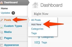
Adding a new post

From dashboard...

  1. Click Posts
  2. Click Add new
  3. Enter a title. (SEO Tip: 70 characters max!)
  4. Past your article in to the Visual editor.
  5. Under Featured Image, click "Set featured image" to set the post's thumbnail. (This may also used when people share your article.)
  6. In Excerpt, enter a short summary of your post. It should be 140 characters, just like a tweet.
  7. In the right sidebar, under Categories, check which category the article belongs in. Pick one. (If you choose a subcategory, your post is automatically included in its parent category.)
  8. Under Tags, enter your tags, separated with a comma. WordPress will auto-suggest tags as you type.
  9. You're ready! Click Publish post.

Operating System

  1. 74.41% iOS
  2. 24.04% Android
  3. 0.74% BlackBerry
  4. 0.71% Windows Phone
  5. 0.04% SymbianOS
  6. 0.06% Other

Mobile Device

  1. 54.18% iPhone
  2. 17.32% iPad
  3. 2.78% iPod
  4. 1.56% Galaxy S III
  5. 1.33% Droid Razr 4G
  6. 1.23% Nexus
  7. 71.05% Galaxy S II
  8. 0.9% Galaxy Nexus
  9. 0.75% Nexus S

Viewport

  1. 43.52% 320x480
  2. 16.92% 768x1024
  3. 12.79% 320x56
  4. 85.82% 720x1280
  5. 2.77% 480x800
  6. 18.18% Other

Based on 553,967 visits to calmingmanatee.com during the month of January 2013. Of which, 28.15% of traffic was from a mobile device, a 5% increase over the previous month.

Compared with the overall internet population, the site's users tend to be under the age of 35, and they are disproportionately childless women browsing from school and work who have incomes between $30,000 and $60,000.