People don't buy features, they buy benefits.
Product pages often highlight just features but that's not what sells products. Benefits appeal more directly a reader's emotions. It's especially true if that benefit is solving a problem.
Let's look at how Apple sells the A6 chip in the iPhone:
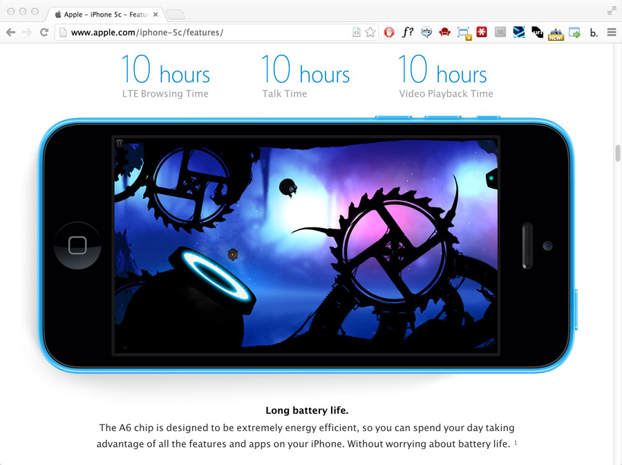
Instead of leading with an explanation of the high zoot architecture of the A6 chip, they sell the key benefit of "Long battery life." No one really cares how the A6 chip is made, but everyone can relate to the pain of a short battery life.
I find the best way to translate features into benefits is to think of what problem or pain they solve for the reader. If I was shopping for a new car, and I was worried about the price of gasoline, then I'd look for cars with good milage. I then might buy a Prius because it gets 46mpg (the benefit) but not necessarily because I want a hybrid. Hybrid drivetrains are a feature, good gas milage is the benefit. As a fuel-economy conscious consumer, I really don't care too much about how the manufacturer achieves great milage, I'm only interested that it's fuel efficient.
Are you selling features or benefits? How are you solving your consumer's pain?