There's two ways to grow your Shopify store's revenue:
- You can get more traffic which will turn into more revenue,
- or you can optimize your store to turn more of your current visitors into buyers.
By focusing on the latter, boosting conversion rate, we're going to lay a groundwork to get the highest possible ROI out of any efforts to drive traffic to our store.
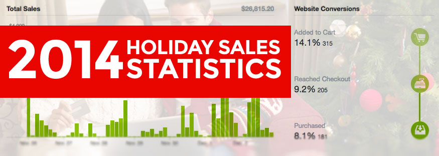
When we talk about conversion rate optimization, we're really looking to make our site is easy and frictionless as possible to buy from. We need to start thinking with our lizard brains and remove any and all barriers to checkout as possible. Based on the past six stores we've looked at this week, here are 25 ideas on how you may improve your store.
Homepage
- Choose your carousel images wisely. 9 out of 10 people will only see the first slide. Don’t assume that people will click the carousel pagination to see the other images.
- Add a call-to-action for every carousel image. At the very least, add a label or some copy that frames the image appropriately.
- Call out free shipping if you offer it. If you don't offer free shipping, try it.
- Make lifestyle shots relevant to your shoppers. Is this how your customers see themselves? Think about their usage, not your product lines.
- Make sure navigation items are easily understood. Make sure that you’re using appropriate language and labeling so the widest possible audience can understand it.
- Have a primary point of focus on your homepage. Above the fold, there may be too many things competing for attention — is it awards? Is it authority signals (“30,000 customers”, “2000 products”, etc) or is it the product lines? If you’d like to improve conversions on your homepage, sometimes removing things is a great place to start.
- Make links look like links. Often links are styled like normal text, so the visitor wouldn’t know to click them.
- Include press mention logos. If you get quoted or featured in the media, show it off! These make excellent trust indicators.
- Optimize your email list calls-to-action. Make sure you’re using smart copy on your email form at the bottom of the page, don’t just use “Join our mailing list” — tell them why and what benefit they’ll receive by subscribing.
- Remove redundant social network buttons. You’re potentially distracting shoppers here, with very little value. They’re in shopping mode, but you’re basically asking them to stop doing that in order to follow you on Twitter, or go to Facebook, or watch your videos on YouTube.In general, you can help your conversions by reducing the amount of distractions and keeping the shopper focused on the buying experience.
Cart
- Decide on one primary call-to-action. “Update Cart” and “Check Out” have the same visual weight; ideally, “Check Out” should stand out more than “Update Cart.”
- Consider removing “Special Instructions” text box. It’s unclear what action you want the shopper to take here and whether it’s a necessary step before check out. What value does this add to the experience?
- Reduce the number of logos around the Checkout button. Shoppers may find the credit card options distracting. If you insist on having them there, consider putting them in grayscale.
Checkout
- Upgrade to Shopify’s responsive checkout. This will boost conversions, especially as mobile usage in ecommerce continues to increase.
- Add a logo. The rest of your site may have great branding, and we can keep it consistent through checkout by adding your logo at the top. It’s easy to do and preserves the shopping experience.
Product page
- Consider bundling similar products. Let's say you sell a widget in six different colors and three different sizes. Rather than list 18 different products, list one product with options.
- Try long form product descriptions. Bonus points for including a narrative that reflects your brand’s story.
- Remove share buttons. They typically just distract the shopper from their buying experience, and you’re unlikely to generate significant traffic from them. What’s worse, is that it has negative social proof if most of your pages have zero “Likes” — subconsciously, it may tell the shoppers that nobody likes the item.
- Don’t rely on tabs for information display. Assume that less than half of people will click those tabs, so don’t put critical information in them.
- Add lifestyle shots. Beyond just white background product photos, try showing a selection of lifestyle shots showing the product in use.
- Remove redundant options. Some themes will display product options when only one option is available; if possible, remove the option to select. Reducing friction and the number of clicks is always a reliable strategy to increase conversions.
- Show shipping and return information. This is a great “objection buster” and preemptively answers a key question for shoppers.
- Add narrative to your product copy. Often product details are displayed in a very stark, “clinical” way — simply stating facts and figures about the product. There’s a huge opportunity here to tell a story and really give some emotion to the item. Sell the benefit. Sell the sizzle, not the steak. A classic example but extreme example is the J Peterman catalog.
Conversion rate optimization is the ideal way to stop leaving money on the table and streamline your Shopify store into a sales-producing machine. When you identify and fix weaknesses in your site, it will promote trust with customers which will leads to sweet, sweet sales.