Shopify Expert Insights

E-Com Advice from our experienced in-house team

Semantic HTML is a style of writing web pages that emphasizes a page's content over its presentation or style. Rather than use HTML tags to just create a document, we use them to describe the content of the document. By doing so, we create streamlined code that has meaning by itself.

Semantic HTML is important to us for three reasons. It makes updating and maintaining a website more efficient by strictly segregating styling from structure, it improves SEO by clarifying content to search engines, and it improves accessibility for audio browsers and screen readers by simplifying code.

The World Wide Web Consortium, who maintains the open standards used on the the Web, believes that semantic HTML is so important that they have made the use of presentational markup tags illegal in HTML5. In this website, we've taken it a step further and used pseudo-elements to keep our HTML strictly semantic. Go ahead and use your browser's view source to take a peek under the hood at our Process page.
We've set up a machine running the Windows 8 Developer Preview to test Metro widget/app development in preparation for client requests, and working on another machine to test Windows to Go. (This might be a good fit for our longer-term freelance contractors.)

So far, we're most intrigued by the Metro UI and, to a lesser extent, the Control Panel. The whole interface appears to be geared towards tablets/touchscreens and casual users, with great potential.  Even with this simplicity, the underlying architecture is sufficiently full-featured to support applications for power users and professionals. I'd love to see a touchscreen solid modeling solution that uses the UI elements of Metro.

Let's dive right in to our lightning review:

Fast boot/UEFI: Convenient, but no longer as important as they once were. Modern users look for devices that sleep and wake quickly, rather than needing to be shut down. Between smartphones, tablets, and laptops, devices are approaching uptimes on the order of weeks and months.

Windows to Go: This will be a boon to corporate users bringing their work home with them. Far easier than traipsing laptops back and forth just for a platform and some files.

Trident Rendering Engine/Chakra Javascript Engine: Probably responsible for the largest part of the perceived increase in speed. The Metro UI appears to use HTML5, CSS3, and Javascript for the info tiles instead of 3D elements as in Aero. Assuming this is the case, the new OS will run far more smoothly on slower/older hardware without the need of a relatively powerful GPU. On the flip side, Chakra does have access to the GPU, so incredibly complex web applications are feasible, such as high-end browser-based games, image manipulation software, or solid modeling. (These are available today, but don't run very smoothly even on the most powerful hardware.)

Windows Store: Much as I hope Microsoft will be able to pull this off, I don't think they have the kind of culture/direction/vision required to build a successful ecosystem. (See: Apple)

Charms menu: The tablet/touch version, swiped in from the side, makes sense and gives a nice central location to rarely used but necessary functions. The non-touch/PC version, on the other hand, looks like it was tacked on as an afterthought. There's no visual indicator that any kind of menu exists in the corner. I ended up finding out about it via accidental mis-click.

NFC: Neat feature to have, but I don't see the point. More and more phones have NFC, which is far more convenient to pull out at a cash register than a tablet or laptop.

Wi-Fi Direct: Hoping this will work as advertised. I'd love to have a Windows tablet that plays nicely with wi-fi enabled devices anywhere.

Ribbon Interface: The best thing about the ribbon is it can be hidden, and I never have to look at it again. A simple interface existed, worked well, and arguably could have been further simplified for more ease of use. Instead, we have a crufty, overloaded interface cribbed from the productivity suite.

Native ISO support: More and more useful with the slow disappearance of optical drives. Also adds convenience with the rapid increase in available hard drive space: I no longer need to carry my physical media with me, I can just have the images locally stored.

ARM Tablet Support/Swipe gestures: With the dominance of ARM processors in the tablet market, Microsoft has a huge market available. Between this, the Metro UI, engine upgrades, Windows to Go, and SkyDrive, it really feels like Microsoft is trying to make this their primary market rather than PCs.

New Control Panel: Nearly makes up for the Ribbon UI. Very simple and clean, allows access to everything a user could need without being cluttered.

Overall we're very excited by what we've seen in Windows 8. It's one of the most genuinely impressive things to come out of Redmond in years. Let's hope it's the start of a new era for them.
Autumn is an exciting time to be outdoors. The summer heat has passed, but the bitter cold of winter has yet to come. This is especially true for us in the midwest where we really only have two months of great weather.

In an effort to enjoy that weather, we attended Evanston Bike Club's 27th annual North Shore Century, a non-competitive 100mi bike ride from Evanston to Kenosha and back. From 4am to 11am, we worked to provide support to attendees.


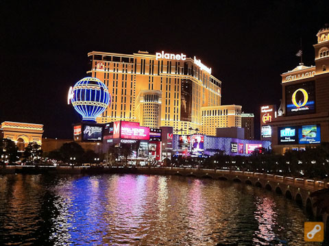
Always looking for insight to the active lifestyle consumer, the EtherCycle team attended Interbike International Bicycle Expo in Las Vegas. There we had the opportunity to meet with over 1,100 brands from around the globe.


The expo began with two days in Bootleg Canyon in Boulder City, Nevada where we were able to demo the latest bike kit on world-class cross country mountain bike trails, epic downhill runs, and even a BMX pump track.


IMBA ranks Bootleg Canyon as one of their "Epic Rides," and we certainly found out why. The riding was just as exciting as the the new gear we saw.


In addition to riding world-class trails with international champions, we saw exhibits, product launches, and insightful seminars. We were happy to meet with top manufacturers, retailers, and media to help promote the business of cycling.
Feature creep is the result of good but misguided intentions. It is perpetuated by the false belief that "the more features it has, the more people will use it!" This line of thinking results in websites that require usability kludges like modal tooltips, FAQs, help guides, and other previously unnecessary bloat.

Stop feature creep by asking these three questions:
1. How does this features support business goals?
2. What percentage of users will use this feature?
3. How often will the feature be used? 

By only investing in features that are useful to a majority of users, we save development resources while improving user experience. It's always better to have a website be great at one thing, than mediocre at several.
The default view of most analytics packages is overall traffic. This is misleading. The effectiveness of a website can not be measured purely by traffic volume since all traffic is not good traffic.

What we really want to know by viewing our traffic data is if our marketing is effective, relevant, and engaging. To engage with your brand, a user has to do more than just load your website once. How long do they spend on the site? How many pages do they view? Do they return the site? A small, engaged user base will always be more valuable than an endless supply of one second page views.

Using advanced segments in Google Analytics, we can isolate traffic data to just engaged users, and then determine which marketing channels are most effective in reaching that target market. For example, a social media campaign may drive the most traffic to your site, but drilling down to just the most engaged users might reveal that organic search is actually driving your conversion rate. With traditional traffic-focused analytics, you would have misguidedly spent more on social media marketing instead of the more effective search engine marketing.* 

The web gives us incredible ways to measure the use of our media. Let's take advantage of these opportunities by focusing on the outcomes of our efforts. Let's build relationships with our customers instead of collecting mindless clicks.

* An April 2011 study by Outbrain revealed that traffic coming from social media sources is actually the least engaged.
While there are endless ways to build links and tweak on-page code in an attempt to game Google, the best way to bring visitors to your site is to give them new and valuable content. Content is the best SEO strategy.

The truth of content as SEO strategy is that more content means more long-tail keyword phrases which means more opportunities for people to find you in searches. If the content is both useful to the user and relevant to your site, it is likely to convert.

You could ask your users to create your content for you (through user reviews or forums), or you can publish your own original content. For most businesses, blogging is the ideal content channel. Yes, I am asking you to sit down and write something.

Blogging for SEO is not nearly as daunting a task as it seems. Consider the questions that your customers ask you on a regular basis. Theyre telling you what they consider your area of expertise. Demonstrate that expertise by answering their questions in a blog post.

In short: There are no quick fixes. You need to give people a reason to come to your site. The best way to do that is by blogging your answers to the questions theyre googling right now.
Quality Assurance is a critical step in the web design process. Before launching a website, we run through the following checklist.

Do all links work?
Do analytics packages (Google, Clickheat) report data?
Is copy edited and error free?
Are favicons present and called in metadata?
Do forms have validation?
Do forms send to the correct recipient?
Do images have alt-text?
Does JavaScript behave as expected, and with a minimum of resources?
Do all pages have descriptive titles?
Do all pages have unique meta descriptions?
Do pages load quickly?
Is a robots.txt present?
Is the server configured & hardened?
Is the site usable at 1024x768?
Is the site usable at 1920x1080?
Is a sitemap present?
Does the site work on Android devices?
Does the site work in Chrome for Mac - Current Version, and two previous versions?
Does the site work in Chrome for Windows - Current Version, and two previous versions?
Does the site work in Firefox for Mac - Current Version, and two previous versions?
Does the site work in Firefox for Windows - Current Version, and two previous versions?
Does the site work in Internet Explorer - Current Version, and two previous versions?
Does the site work on iPad?
Does the site work on iPhone?
Does the site work in Safari - Current Version, and two previous versions?
Has the client signed off on it?
Has the sitemap been submitted to Google, Bing, and Yahoo?

The above checklist is our final measure in assuring quality for our clients. Ultimately the best acid test of the site's quality is how users perceive it.
We recently helped a client improve their conversion rate 36% by adding a guest checkout as the first step in their checkout process. Just as in a grocery store, customers want the fastest checkout possible. Guest checkout removes both a step and the perceived mental hurdle of account creation.

We suspect, but have not tested, that guest checkout subsequently improves repeat purchases. By circumventing passwords, the anxiety of trying to remember a password is removed.

This doesn't mean we should abandon registrations entirely. We discovered in customer surveys that some users, especially older ones, feel as though their order will be "lost" if they're unable to associate an account with it.