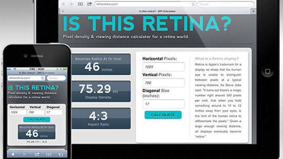
Shopify Expert Insights

E-Com Advice from our experienced in-house team


Is This Retina? - http://isthisretina.com/

While trying to choose an external monitor to pair with a new MacBook Pro, we were left wondering about every display, "Is it retina?"

In response to this seemingly simple need, we built an online tool that calculates display density based on size, and then determines at what viewing distance the display will be considered retina-equivalent.

(We still aren't sure which monitor to pair with that MacBook Pro though.)
What is retina?
Retina is Apple's trademark for a display so sharp that the human eye is unable to distinguish between pixels at a typical viewing distance. As Steve Jobs said: "It turns out there’s a magic number right around 300 pixels per inch, that when you hold something around to 10 to 12 inches away from your eyes, is the limit of the human retina to differentiate the pixels."

Why does retina matter?
Because website graphics not prepared for retina will look fuzzy. They don't just look a little fuzzy, they look downright crappy (and I don't even have 20/20 vision.)

The technology to make the "retina" effect possible requires previously unheard of displays resolutions. For example, the new iPad has a display density that's more than twice as sharp as 21.5" "Full HD" monitor. Even a Blu-Ray movie is not high-enough resolution to take up the full width of a new iPad display. It would have to be stretched or "pixel-doubled." This processing is what results in fuzzy graphics.  

How do we support it?
Fortunately there's hope. By moving away from photographic images, and using vector graphics instead, we can make websites which render on and scale to whatever device you have. Fonts, SVG, and CSS3 effects are all valid solutions. (This should be best practice anyway as it creates far more flexible sites.) 

In some cases photographs must still be used and that's okay. The solution then is to sacrifice page speed and load double size images. To maintain small file sizes, this should be done sparingly.

Further Reading:
For years, the pen tool taunted me. It sat in my toolbar, mocking me with its steep learning curve. Finally I mastered the tool with a simple exercise. I signed a sheet of paper with a large marker, scanned it in to Illustrator, and spent two hours forcing myself to outline it using the pen tool. I faced my fear, and you should too:


Skip ahead to 3 minutes for the basics.

Card sorting is a straight-forward approach to include your client in the information architecture phase of the website design process. A card sorting exercise will allow you to form the structure of a website, organize it logically, and even determine labels.

It works amazingly well, physically mapping out the geography of thought processes is super productive.

There are two kinds of card sorting: open or closed. In open, participants sort cards in to related categories, and are then asked to give each category a name. In closed, participants sort cards into existing categories. When starting a new site, we use open. Closed is good for testing existing labels.

Running your own card sort is easy:

  1. Make a list of the top 100 most important content in the project: pages, topics, & features. Everything if necessary.
  2. Label index cards with each topic from that content inventory list.
  3. Include blank cards for new (or missed) topics.
  4. <
  5. Shuffle the cards, then spread them out on a large work surface.
  6. Ask participants to sort the cards in to related groups.
  7. If this is an open card sort, ask the participant to label each category.
  8. Photograph the results, reshuffle, and repeat as necessary.

According to usability guru Jakob Nielsen, you must test fifteen users to generate statistically reliable results.