Shopify Expert Insights

E-Com Advice from our experienced in-house team

Change your outlook on design thinking with these usability insights.

When designing a website, its important to base the design around organizational goals, as well as usability best practices. But where do these best practices come from? Sure, some of them are teased out through experience, but there's also hard research on how people see websites. Literally. It's called eye-tracking. By knowing where and how people look at the screen, we can infer some best practices.

Source: Crazy Egg

We've learned a lot in the past year on how to build a website that builds a business. For 2014, we've boiled it down to three simple rules that will put you head and shoulders above your competition.

1. No more bullshit. (This is my favorite.)

If your site can't tell someone what they want, when they want it, and on the device they want it, they're going to click that back button within 5 seconds and move on to someone who can.

Your website takes 10 seconds to load? Too bad. The customer is moving on.

Your website has a splash page? That's not useful and this isn't 1998. The customer is moving on.

Your website auto-plays music? Obnoxious. Once she finds which browser tab is playing music, she's closing it and moving on.

Don't put up an impediment to her deciding on you. Be the one professional that gives her a great experience that starts with a website that just works. No more bullshit.

2. Mobile first.

I could ask the rhetorical question of whether or not your own a smartphone, but I already know the answer: you probably do. The start of 2013 marked the tipping point for smartphone users. There are over one billion smartphones in the world. That's 50% of people in the US, which means more people are getting online from their mobile device instead of their computer.

Even though the majority of people have smartphones, most websites haven't caught up. They aren't designed with mobile in mind. Just because the site loads on the phone, and you can pinch and zoom and scroll your way around, doesn't mean it's designed for mobile. People are impatient, they won't hunt around a bad website on their 4" screen. They want an easy to use design and don't care if that design belongs to you or your competition.

On the web, we know people buy based on the perception of professionalism. Having a website that looks perfect on any size device, immediately puts you head and shoulders above your competition.

3. Have a goal.

Everything on your website should drive your customers to take action. If it doesn't, get rid of it. It's superfluous.

If your site has attracted the right people, informed them about who you are, and inspired or engaged them through great content, then the final step is to get them in a relationship with you.

Give her more than one option. If the only call-to-action on your website is a "contact us" page then you don't have any calls to action. Let her follow you on Facebook, follow you on Twitter, or even better, sign up for your newsletter. Include a contact form in the footer of every page. Put your phone number and email in the header. Don't be coy, you want her to contact you, give her your number.

So to sum up our winning three point website strategy...
  1. No more bullshit. Make using a website as seamless as possible.
  2. Mobile first. If it doesn't work on a smartphone, it doesn't work.
  3. Be goal oriented. Once your website is generating high-quality leads, it's stopped being a brochure, and started being a marketing system.

I know that a website or marketing probably isn't as fun as your business, but if you learn and follow only these three rules, you can go out and do the stuff you love doing for your customers because your website will be a lead-generation machine.
No idea is stupid if you can monetize it.

To explore projects outside of clients demands, we began a Labs initiative in March 2012. Think of it as a palate cleanser between client work. It's resulted in about ten completed projects. The formula is pretty simple. Find a problem, build a website to solve it. If it can be done in an afternoon, we don't even think about it. We just do it.

Of the ten sites we've built in the last year, the most popular are:

  1. RainyCafe
  2. CalmingManatee
  3. Is this Retina?
  4. Will there be mail today?

Getting traffic is a pretty straight forward process. Submit the site to blogs in relevant niches. In the case of RainyCafe, we submitted it as a tip to Lifehacker who posted it the next day. Once you've got a major blog exposure like that, having frictionless sharing (in the form of social media buttons) is enough to keep it going. However, this assumes the content is compelling enough to share to begin with.

Sometimes doing that much isn't even necessary. CalmingManatee was different. We tweeted it once, and about a week later it was everywhere. A million visits in the first month everywhere. We received requests for interviews from NPR, Huffington Post, and some other random blogs as a results.

The success of these afternoon projects was a pleasant surprise, and the free publicity was welcome, but what would be even better is some extra revenue. As freelancers, having recurring revenue is critical to building our business.

Our first attempt at monetization was to sell Manatee greeting cards through Zazzle. After six months, we sold so few that we couldn't meet the the threshold to get paid out. Fail.

We switched to donations. Using WePay, we allowed people to donate via three suggested donation levels. That netted about $100/mo. Better but not great. We had to reconcile dozens of micro-transactions in Quickbooks which, when you factor the time, made it a net loss. Fail again.

Then we tried making a RainyCafe iOS app that we planned to sell for $1. Apple rejected it because they found that our Rainy Cafe app provides "a very limited amount of content and a very limited set of features" specifically because it "only contains two ambient noises." Strike three.

Finally, I got off my high horse and switched to AdSense. Here's our earnings for the last 30 days:

Not only did we hit out of the park with AdSense, but it was the easiest of our four monetization attempts to implement. I wish I'd done it sooner.

Lesson learned: Simple is great. Ever since CalmingManatee, if someone in the office has an idea that can be implemented in less than an afternoon, we don't even debate it, we just implement it, put AdSense on it, and see what happens. Some work, some don't. At the very least, we always learn something from it.

Sometimes usability doesn't have to be complicated. By recognizing convention, we can build consistent and easy to use interfaces.

In every state, in every city, at every intersection across America, stop lights are red. Red means stop. But what if a city planner thought, "Hey, red is boring and I think it's hard to see. Everyone does red. Our city is new, and different, and exciting. Let's do a different color. Let's go with purple." The results are obvious. People wouldn't know what the purple light meant. The city planner might then say, "Ah, we just need to label it STOP to teach them." Now we've moved from ambiguity to cognitive dissonance. Drivers know it's a signal that says STOP, and they'd probably STOP, but they'd have to think about why its not red because they've been trained by a thousand other stop lights that red means stop and stop is red.

Consistency and convention are important elements of design. We can build on convention so that new visitors to a website can intuit how to use it and where to find what they're looking for. We can reinforce convention through consistency. By designing content templates instead of individual pages, we'll keep elements and layouts of a website similar, so that our returning visitors will recognize new content but it'll still feel familiar. Familiarity makes for happy customers.

In his blog, Eric Davis recently wrote, “Many years back I heard from somewhere that you should learn one layer above and below where you do most of your work. This was specifically for programming and implied your programming stack.”

I think the same rule can be applied to designers. For some designers, Photoshop is the primary layer of their work. But what's below it? For a web designer, HTML and CSS are below it. To be a better designer, I learned HTML and CSS. Above Photoshop is the user. Now that's a complicated layer. To understand the user, we need to study usability, accessibility, and even human psychology.

A designer that doesn't understand the layers above and below Photoshop doesn't want to be a designer, they want to be an artist. A designer who knows their stack, makes informed design choices from the start that result in sites that are go beyond aesthetics, they're functional to meet demanding goals.

OS X 10.9 Mavericks' energy-saving feature may be delaying your uploads.

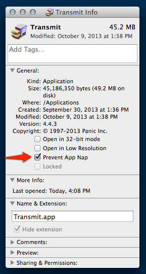
After updating to OS X 10.9 Mavericks, we noticed that when saving in TextMate to a remote server with Transmit, the upload would be delayed by several seconds. This is a side effect of App Nap, a new feature suite of energy-saving policies applied by default upon applications.

Fortunately, there's an easy fix. From Finder, Get Info on Transmit.app. Check "Prevent App Nap". You're done!

What if you wanted to have greyscale images on a site that turn to color when the user hovers or taps?

Rather than load two separate images, we can apply a grayscale effect to a single color image using CSS.

img {
    filter: url("data:image/svg+xml;utf8,<svg xmlns=\'http://www.w3.org/2000/svg\'><filter id=\'grayscale\'><feColorMatrix type=\'matrix\' values=\'0.3333 0.3333 0.3333 0 0 0.3333 0.3333 0.3333 0 0 0.3333 0.3333 0.3333 0 0 0 0 0 1 0\'/></filter></svg>#grayscale"); /* Firefox 10+, Firefox on Android */    
   -webkit-filter: grayscale(100%);
   -moz-filter: grayscale(100%);
   -ms-filter: grayscale(100%);
   filter: grayscale(100%);
   filter: gray; /* IE 6-9 */
}

Then, to disable it on hover...

img:hover {
   -webkit-filter: none;
   -moz-filter: none;
   -ms-filter: none;
   filter: none;
}

It's even cross-browser compatible down to IE6.

Hosting provider Radware compared the performance of top retail websites. As web pages continue to slow down, user demands increase. 57% of users abandon pages that take longer than 3 seconds to load, and are measurably less likely to convert from browsing to buying.


Source: Radware

We love fast things. Fast cars, fast food, and especially fast websites. That's why we put together the Website Performance Checklist. It's 23 tips, tweaks, and best practices to improve the performance of any website.

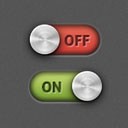
For RainyCafe, we wanted toggle photo realistic toggle switches as our checkboxes. To achieve the effect we used an image sprite and some CSS trickery.

RainyCafe toggles

The magic here is that the checkbox is hidden, and the label itself is what we style. The label is an image of the switch's on/off lozenge, and the label's span is the switch's pin.

See the Pen CSS-Only Sliding Toggle Switch by Kurt Elster (@kgelster) on CodePen

Check it on CodePen.