
Sticky menus are a design pattern that fix the navigation to the top of the page.
While sticky menus make navigation quicker, they also present a new problem: They take up screen real estate. That might not be a problem for the six percent of you with 30 inch monster displays, but for the rest of us with 13" notebooks, it's annoying. Fortunately, we've come up with a mostly CSS solution:
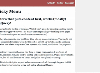
Responsive design lets us solve the problem by moving the navigation out of the way out of the content. We've made a demo, we call it Crazy Responsive Sticky Menu.
On most displays, the menu is in the gutter or sidebar. I say most because this thing is crazy responsive. It works on all display widths, down to 320px. Yes, in all widths, the menu remains fixed to the top and readily accessible. On phones we cheat a little by using the popular iOS sliding menu style, but it's cool because we keep a navigation icon pinned to the top.
There are no dependencies. Aside from a little bit of JavaScript to append a class name on scroll, all the magic happens in CSS. This keeps your page load time low, and let's us sleep better knowing we're not using abusing jQuery.
Try out the demo or steal the code.