Let's say you've invested a boatload of cash in to a marketing campaign, redesigned your site, and suddenly discovered that your conversion rate collapsed. You're panicked because you're wasting money on advertising that's going nowhere.
We recently had a client in that position. During a successful Kickstarter campaign and accompanying redesign, they were losing sales. Oh snap. We can fix that.
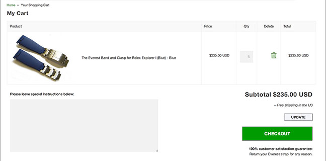
Analyzing their sales funnel, it became clear that customers were adding items to cart but never reaching checkout. What could be the problem? After all, this cart doesn't look so bad:
In a situation like this, there isn't time for split testing. You need to act fast and gain quick wins. Look for problems, apply best practices, and make educated fixes.
It's important to work with a theory and let that guide decisions. In this client's case, I suspected that since 65% of this client's customers weren't in the US, English may not be their first language. For those people (and their Google translator) the best course of action is to simplify for quick wins.
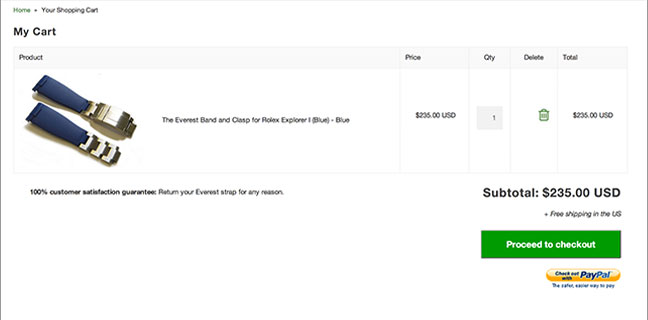
After several simple changes, we ended up with 133% boost in conversions.
Here are the changes we made (and you should consider trying.)
- Hide extraneous inputs We removed the "special instructions" field. What could that possibly include anyway?
- Remove unnecessary text. This site had a note about currencies but didn't actually support multiple currencies. Removed!
- Remove extra buttons. Having multiple buttons creates confusion. In this case, the update button came before checkout. Awful.
- Simpler layout This site had a customer guarantee near the checkout button. Well we like that, we don't necessarily want it so close to the checkout button. We instead moved it to the left of the button area, where should actually be read more according to eye-tracking studies.
- Accurate button labels The checkout button label previously was "CHECKOUT"– seems simple, but it's high-pressure. We replaced it with "Proceed to checkout," which is lower pressure and a more accurate description of what the button does.
As we've often see before, it is always small changes that better enable people to buy from you. To maximize sales, you need to make it as easy as possible for them. No one is going to learn how to use your website. They're just going to move on to someone with an easier-to-use site.