Shopify Expert Insights

E-Com Advice from our experienced in-house team

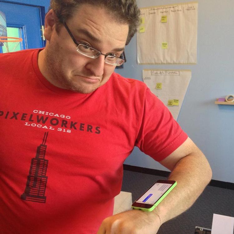
It's been an entire week since the announcement, so I'm sure you're totally clamoring to read yet another take on the AppleWatch. That's good because I've had an entire week to noodle on it, and as you might have guessed, I Have Opinions.

1. It's called AppleWatch and not iWatch because Apple is starting to worry about creeping genericization of their trademarks. Apple products so completely dominate the mindshare of the portable hardware industry that most (regular) people just call their things an iName. This had already happened with iPods (then again when was the last time anyone used an MP3 player not made by Apple?). I've heard several Moms I know say things like "I have a Samsung iPhone." Even NFL announcers refer to the (paid, product placed, and heavily branded) Microsoft Surfaces on the sidelines as "iPads." Harder for people to confuse the actual name of the product when the name of the company is in it.

2. Using the crown as an interface made everyone at the office go OOHHHH! at the exact same time. It's so damned obvious once you see it. Watches have used crowns as "interfaces" for years, but the first thing all the other smartwatch manufacturers did was strip it off. Apple kept it for a consistent watch UI, extended its abilities, and helped solve the problem of big fingers trying to scroll on a small screen. This is what happens when you put in the effort to care about hardware design and user experience.

3. I was surprised the price point for the entry-level AppleWatch is only $350. The Ethercycle office consensus was that they wouldn't go below $400, and I wouldn't have been shocked at $450. At $350 they won't be able to keep them in stock. It's only $50-$100 more than Apple's competitors, which is generally where Apple pricing ends up. Thanks to some new clients we've picked up recently I've gotten a crash course in the watch market over the past few months, and $350 is pretty cheap for a mid-level watch. Note that I didn't say "luxury" or "high-end", that is a completely different ballgame, I'm talkin' regular ol' watch that looks good and just tells time. The low/midrange mechanical watch market is going to get slaughtered.

4. It's verrrrry interrresting that no price has been announced for the gold "Edition" edition (god, what a stupid name). Apple is trying to feel out how high they can go, and the sky is the limit. Techcrunch claims it could sell for $1,200. Cringley says $3,500. John Gruber thinks $5,000. I think Cringely and Gruber are close to being right, and it could be more. $4,000 is nothing for a luxury watch. The cheapest Omega starts at $1,800. The cheapest gold Tag Heur is $4,200. The cheapest Rolex (that don't tick-tock) is $5,000. And these are the lowest models, it's easy for a luxury watch to go over $20,000. People like showing off how much money they spent on something - hell, that's the entire point of the luxury watch industry. The most expensive iPhone is always the highest selling model. And "champagne" (read: gold) is the highest selling color. I say again, $4,000 is nothing for this market.

That being said, Rolex and Hublot are competing in a completely different world than Apple. They can get away with charging those prices because their names convey a level of status and luxury that Apple doesn't. These watches are looked at as heirloom pieces that will hold their beauty and value for decades. Will an AppleWatch model be seen as a useful item for even 5 years? Do you want a cell phone from 2009 (say an iPhone 3GS) today? Hoping to pass your vintage iPod Mini down to your children? Apple is taking the idea of being a high fashion luxury brand very seriously, poaching executives from Burberry and Tag Heur. Still, the big guys will be safe.

5. I'm unconvinced at how much the watch can move Apple's bottom line - that's not a slam on the product, merely that Apple is a behemoth. Swatch Group made $9 billion in 2013. Apple made $170 billion in 2013 - so managing to equal the largest watchmaker in the world would increase revenue by 5%. Obviously Apple intends to grow the watch pie, the same way they did with smartphones, but how big can the pie really get?

(NOTE: the preceding two paragraphs are the ones you can throw back in my face in 7 years when Apple controls the watch industry and I look like an idiot.)

6. The smartwatch will become huge when the apps really get moving. When you can use your watch to make payments, track your health, control your house, etc. that's when it will seem like a no-brainer to buy. The killer app/service that makes everyone want a smartwatch probably hasn't been thought of yet. Think before 2007, would you have ever thought that people would buy a $400+ phone? Much less see it as being totally indispensable?

7. I can see myself being in the market for an AppleWatch 3 - after they've worked out the kinks, have the apps up and running, it includes a SIM card, and it looks like a Moto360.

Michael DiMartini from Everest Bands come on the show to chat and share his success with us. He’s gone from failed businesses to two successful Kickstarter campaigns and an amazing product line sold through Shopify. Michael doesn’t just sell watch bands. He sells literally the best rubber watch strap made- and it’s for a Rolex.

We discuss:

  1. What Everest Bands is all about (it’s more than just swiss rubber)
  2. What goes in to a successful Kickstarter
  3. The ROI of Facebook likes
  4. What it takes to be a luxury brand
  5. The Apple Watch
  6. Michael’s favorite watch
  7. And his single best tip for Shopify store owners.

Give it a listen now or their download the MP3 for later.

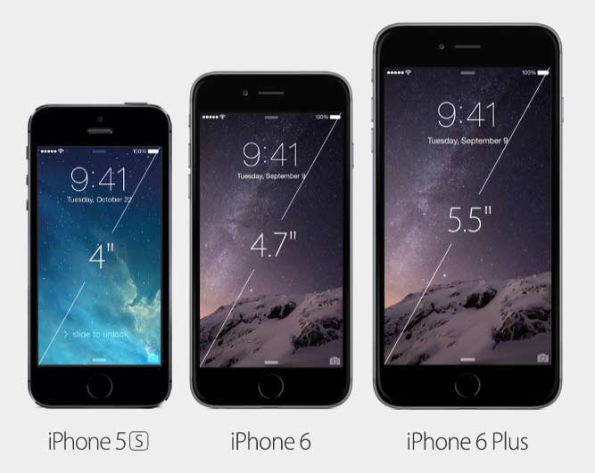
Everyone's going gaga about the new screen sizes for Apple's latest iPhones. (Us too, we take office bets on the Keynotes.) The iPhone 6 has a 1334x750 display while the even bigger iPhone 6 Plus comes with a whopping 1920x1080 screen. This is in comparison to the iPhone 5 which was only at 1136x640. The secret sauce in Apple's Retina technology is that it tells websites that it's screen is only half as sharp as it really is, so when it comes to websites, every iPhone up until today has had a screen that was 320px wide.

The new iPhone 6 however, will report itself as 375px wide - and the iPhone 6 Plus will be probably be a stunning 540px viewport! This represents a big question and opportunity for your website. You might be saying "But my website is already responsive, I'm covered." Well, maybe yes, and maybe no. If your site was built with a fully flexible fluid layout that covers all sizes, you're probably fine. (That’s the right way to do it anyway.) However, many websites that claim to be responsive, really just reconfigure themselves to specific, preprogrammed "breakpoints" that match up with a few (often as little as 3) popular devices. This can leave the customer high and dry when new phones come out and these breakpoints change (like today!).

Our design philosophy has been to use fully flexible designs whenever possible. While other designers were treating the space between 320px (iPhone) and 768px (iPad) as a no man’s land of screen sizes to cut corners and save themselves time, we’ve been writing fluid code dictated by content instead of devices.

You can check how your site will look on an iPhone6 by resizing your browser window and seeing where it breaks. If it always looks good, congrats, you have a fluid layout! If it breaks at various sizes, then you can either choose to let the future king of all mobile browsing show a jacked-up version of your website to your customers, or you can get it done right. What’s that old saying? Oh yes: If you think it's expensive to hire a professional, wait until you hire an amateur.

Transactional emails— those emails that your Shopify store sends out on your behalf to your customers— are important and often overlooked part of your store's customer service experience. Most store owners leave them untouched, and while they default Shopify templates work well enough, they can certainly be improved.

Those transactional emails are a great way to build repertoire with your customers... and without an effort on your part. Think about it. For every order in your store, a customer is going to get at least two emails. One when they place they order, and one when their order ships. If you have cart recovery enabled (and I hope you do) that's potentially three emails a customer will get from you. That's three opportunities to build your brand.

Rewriting the emails in your voice- so they sound conversational- is a great place to start. Even just so they sound human, it'll boost confidence. There's also You can also gain value from them by asking your customers about their experience, asking for referrals, asking to connect on social media, including survey links, or advising them of new products.

We've written a few templates for our Shopify clients that are a great place to start.

"Abandoned Checkout Notification" Email Template

Subject: do you need any help with your order?


Hi {{ billing_address.name }},

Joe here from Acme Corp.

I saw you put together a shopping cart on our site but didn’t finish your order. Do you need any help? Or did you have any questions about the order I can answer before you submit it?

If there’s anything I can do, just hit the reply button and drop me a line with any product or order questions.

Your shopping cart:

I’ve included a list of your shopping cart contents below. You can click this link - {{ url }} - to load up the shopping cart again.

{% for line in line_items %}{{ line.quantity }}x {{ line.title }}

{% endfor %}

If you need to discuss your order in more detail, feel free to call me.

Cheers!

Joe from Acme Corp

"Order Confirmation" Email Template


Hi {{ billing_address.name }},

We're sure you can remember what you ordered, but below is a confirmation and all the details you could possibly need.

If you have any questions at all, just reply to this email or give us a call.

All the best,

Joe from Acme Corp

PS: Would you mind taking a 47 second survey? It'll help us improve the site? Here's the link: http://yoursite.com/pages/survey/

Date {{ date | date: "%m/%d/%Y" }}{% if requires_shipping %}

Shipping address

{{ shipping_address.name }} {{ shipping_address.street }} {{ shipping_address.city }}, {{ shipping_address.province }} {{ shipping_address.zip }} {{ shipping_address.country }}{% endif %}

Billing address

{{ billing_address.name }} {{ billing_address.street }} {{ billing_address.city }}, {{ billing_address.province }} {{ billing_address.zip }} {{ billing_address.country }}

{% for line in line_items %}{{ line.quantity }}x {{line.title }} for {{ line.price | money }} each

{% endfor %}

{% if discounts %}Discounts : {{ discounts_savings | money_with_currency }}{% endif %}

Subtotal : {{ subtotal_price | money_with_currency }}{% for tax_line in tax_lines %}

{{ tax_line.title }} : {{ tax_line.price | money_with_currency }}{% endfor %}{% if requires_shipping %}

Shipping : {{ shipping_price | money_with_currency }}{% endif %}

Total : {{ total_price | money_with_currency }}

"Shipping confirmation" Email Template


Hi {{ billing_address.name }},

Just a quick update... your order is now on its way to you. It'll be with you soon, but if you want to keep an eye on it, you can follow its journey here: {{ fulfillment.tracking_url }}

If there is anything else we can do, just reply and let us know.

Joe from Acme Corp.

PS: In the meantime, check out what's new on the site: http://www.yoursite.com/collections/whats-new - Go on. We won't tell.


You'll find them order Admin > Settings > Notifications

While the tags in these emails make them a copy & paste affair for Shopify, they'll work for any ecommerce platform. I like them because they sound friendlier than the standard "shipping robot" emails that most companies send out to their customers. Give them a try. You'll find by inviting the conversation with your customers, you'll be top-of-mind when it comes time for recurring purchases.

Let's say you've invested a boatload of cash in to a marketing campaign, redesigned your site, and suddenly discovered that your conversion rate collapsed. You're panicked because you're wasting money on advertising that's going nowhere.

We recently had a client in that position. During a successful Kickstarter campaign and accompanying redesign, they were losing sales. Oh snap. We can fix that.

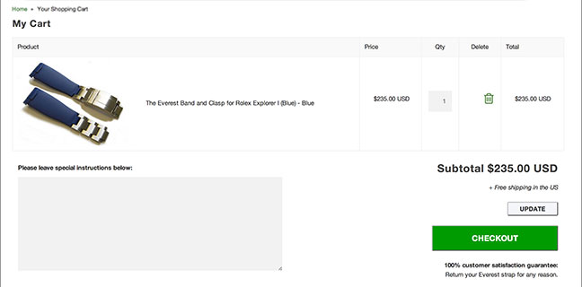
Analyzing their sales funnel, it became clear that customers were adding items to cart but never reaching checkout. What could be the problem? After all, this cart doesn't look so bad:

In a situation like this, there isn't time for split testing. You need to act fast and gain quick wins. Look for problems, apply best practices, and make educated fixes.

It's important to work with a theory and let that guide decisions. In this client's case, I suspected that since 65% of this client's customers weren't in the US, English may not be their first language. For those people (and their Google translator) the best course of action is to simplify for quick wins.

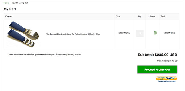
After several simple changes, we ended up with 133% boost in conversions.

Here are the changes we made (and you should consider trying.)

  1. Hide extraneous inputs We removed the "special instructions" field. What could that possibly include anyway?
  2. Remove unnecessary text. This site had a note about currencies but didn't actually support multiple currencies. Removed!
  3. Remove extra buttons. Having multiple buttons creates confusion. In this case, the update button came before checkout. Awful.
  4. Simpler layout This site had a customer guarantee near the checkout button. Well we like that, we don't necessarily want it so close to the checkout button. We instead moved it to the left of the button area, where should actually be read more according to eye-tracking studies.
  5. Accurate button labels The checkout button label previously was "CHECKOUT"– seems simple, but it's high-pressure. We replaced it with "Proceed to checkout," which is lower pressure and a more accurate description of what the button does.

As we've often see before, it is always small changes that better enable people to buy from you. To maximize sales, you need to make it as easy as possible for them. No one is going to learn how to use your website. They're just going to move on to someone with an easier-to-use site.

A reader asked, "How’d you get your site to locate me and use that location in the title? I’ve never seen that before."

They're talking about the geolocation trick we use on WebsiteRescues:

Personalization is a great way to grab people's attention, and stand out from the competition. Most people who see their city or metro area echoed to them will read on. I've watched the look of surprise on reader's faces when I show them a site using it.

It pays divides too. We've seen personalization boost conversions up to 20%.

It's easy to do, and free for the first 1,000 daily visitors to your site. (I don't have that many.)

This lives in the header:

And this is the headline echoing the city:

Turn your website into a revenue generating machine for your city; ?> business.

Here's how it works. When a visitor lands on your site, on page load, their IP address is sent to IPinfo for geolocation. IPinfo then returns their city which we store in a variable to echo throughout our copy.

You could extend this further. In addition to city, IPinfo will also return state, and country. Using that info, a clever use of geolocation could be to auto-populate forms for your visitors' convenience, improving conversions.

As part of our Website Rescues conversion optimization and best practices packages, we focus on quick wins for our clients to immediately boost conversion rates. They’re based on key usability findings from research done by centers like the Nielsen Group. Many may seem like common sense, others may change your outlook. For most of our clients, we'll typically make thirty changes on average. I recently reviewed the last several we did and pulled out some that are just plain good advice for any website or landing page.

  1. Remove or replace irrelevant images.
    Obvious stock photos like the classic smiling girl wearing a headset hurt conversions. If you have a product, show photos of the actual product itself.
  2. Use explicit microcopy.
    "Click here" and "Submit" are death for conversion rates. Try something big and explicit like "Download your free report now"
  3. Buttons should look like buttons.
    It's possible to over design a button until it's no longer obvious what to click, especially with the takeover of flat design. Make sure your buttons are as obvious as possible. Make them bigger, change their colors, add CSS animations to them if necessary. Do the same with links. This makes it clear to users what is and is not clickable text.
  4. Make text easy to read.
    Making your website more legible enables users to skim it before reading it. Try starting with black 16pt text on white with a 1.5em line height for your body copy. Reducing line width makes skimming easier as well.
  5. Proofread!
    You'd be surprised how often typos or just poor writing makes it in to production. Good grammar improves confidence.
  6. Reduce load times
    While this is a service on its own, we've found that unoptimized websites can have their load times cut in half simply optimizing their images using a tool like Kraken

Quite a few changes, and while no one is significant on its own, all of them together will make a better experience for your users. Anything that makes a website easier to use or more trustworthy is going to boost conversions or satisfaction. Test it yourself and see.

(Yeah, I know that title made your heart all a-flutter)

When building the website for my upcoming wedding, I had a bright idea - why not create His and Hers versions of the site? The general layout could stay the same, but the styles could be radically changed via CSS. I could put in a switch that would allow the user to flip back and forth. While this could be done with a styled checkbox input (much like we did on RainyCafe), I decided to do this this via the range input, because I have a strange fascination with it and I liked the idea of the user pulling something instead of just clicking it. Of course the browser default style wouldn't do, I had to Make It Look Niceâ„¢

Like any other recently-implemented element (Internet Explorer got range inputs in Feb 2013, Firefox in Aug 2013. Chrome's had it forever, natch) this turned out be easier said than done, and I needed to give myself a quick crash course in all the different browser proclivities. Now, to make things easier for everyone else, here's all my knowledge collected in one place. All of this works for Chrome, Safari, Fx 23+, and IE10+. IE9 users will need a polyfill or are SOL (but we don't want to encourage those people anyway). Let's get started.

First we'll do the actual slider area.

/* Kill focus so you don't get stupid outlines on things */
::-moz-focus-inner {outline:0;}
:focus {outline:0;}

/* Styling the tracks. Each browser needs certain elements to be done separately or it barfs */
input[type=range] {
	padding: 0; margin: 0;
	background: transparent;
	box-sizing: border-box;
	vertical-align: top;
	-webkit-appearance: none;
	width: 220px;
	border: 2px solid #898989;
	background-image: linear-gradient(to right, #ff55b1, #42a8f7);
	border-radius: 30px;
	box-shadow: inset 0px 3px 6px 1px rgba(0,0,0,0.25);
	color: transparent;
	height: 21px;
}

input[type=range]::-moz-range-track {
	border: 2px solid #dddddd;
    background-image: linear-gradient(to right, #ed4fa5, #3a94d9);
	height: 21px;
	border-radius: 30px;
	box-shadow: inset 0px 3px 6px 1px rgba(0,0,0,0.25);
}
input[type=range]::-moz-focus-outer {border: none;}

/* IE needs track colors defined for both before and after the thumb passes */
input[type="range"]::-ms-fill-upper {background-image: linear-gradient(to right, #ed4fa5, #3a94d9);}
input[type="range"]::-ms-fill-lower {background-image: linear-gradient(to right, #ed4fa5, #3a94d9);}

/* IE has it's own special default track w/tick marks that need to be hidden */
input[type="range"]::-ms-track {
	border: none;
	color: transparent;
}

See the Pen vpKru by Paul Reda (@paulreda) on CodePen.

Then the thumb button

/* Now styling the thumbs. Again, each sold separately. */
input[type=range]::-webkit-slider-thumb {
	height: 54px;
	width: 54px;
	background-color: transparent;
	background-image:url("../img/thumb.png");
	background-size: contain;
	border: none;
	outline: none;
	cursor: pointer;
	-webkit-appearance: none;
}

input[type=range]::-moz-range-thumb {
	height: 54px;
	width: 54px;
	background-color: transparent;
	background-image:url("../img/thumb.png");
	background-size: contain;
	border: none;
	outline: none;
	cursor: pointer;
}

/* In IE, the thumb CANNOT be bigger than the track. This sucks. So we call a different thumb image. */
input[type=range]::-ms-thumb {
	height: 54px;
	width: 54px;
	background-color: transparent;
	background-image:url("../img/iethumb.png");
	background-size: contain;
	border: none;
	outline: none;
}

/* IE also has a tooltip that appears by default. This can't be styled, only hidden, so we hide it. */
input[type=range]::-ms-tooltip {display: none;}

See the Pen mzluc by Paul Reda (@paulreda) on CodePen.

And here's what we end up with. First IE, then everything else

As you might expect, IE is the bad boy in all of this with it's inability to have a thumb button that's larger than the track, constraining what kind of designs you can use. That being said, I do like that IE & Safari will fire off events while you're still moving the thumb, while Chrome & Firefox will not fire anything until the user stops moving the slider and releases the mouse button. Overall, this gives Safari the best implementation with both a full range of style options, and a better user experience.

My main problems at work boil down to clients telling me what they want me to do, instead of telling me what they want to happen. They contact us with a list of demands already laid out - Move the 'Add To Cart' button. Make the design cleaner. Put a carousel on the homepage. Make the logo bigger. What's happening here is they see a problem in their business and have decided on what they think the "obvious" solution is, so they're price shopping for a pair of hands they can remote control via phone/email.

In reality they're just throwing shit against the wall, and pointing out changes that would make them "feel" better in the hopes that after they are made the bottom line will improve. This frustrates me because in a lot of cases the changes they want are pointless and a waste of my time and their money. If the client could let go of their preconceived "fixes", and instead tell us about what outcome they are searching for - "I need more hits", "Increase my conversion rate" - it can open up a wide range of solutions they never knew existed.

When a potential client calls with a list of demands, we ask them "Why?" What are you trying to accomplish with these changes? What event sparked you to call? We want to know your motivation because you yourself might not even see what the problems are. We're trying to learn what you don't know. Why do you think you need more social buttons? Because you think it'll somehow increase sales? Because your pet competitor did it? The problem is you don't know what you don't know. Everyone thinks they know all there is about their business and interprets things through that prism, but adding a pair of fresh eyes can help you find the unknowns that you are missing. I'll stop before this turns into a Donald Rumsfeld answer, you get the drift.

We care enough to investigate what your problem is, because if you know the problem, and the motivation, only then can you come up with a solution that's custom tailored to the client and their project. Different clients who claim to have the same problem on the surface, may require different solutions because their goals are different. Our questions allow us to learn that they have different timelines ("I have a trade show in 2 weeks!" vs. "My busy season isn't until the holidays"), different thoughts on branding (a white label reseller vs. a luxury brand), different financial restraints (Fugazi vs. Jay-Z*). All see themselves as having problems (Jay-Z more than others), but their actual needs are different. One might get a quick website rescue, the other might be better served with an entire redesign with new strategy and branding. As a philosopher once said, "What might be right for you, might not be right for some."

*Given recent developments, maybe this should instead be Dr. Dre

In 2013, our top 3 ecommerce clients received over $10 million in revenue from online sales. That wasn't an accident and they didn't get lucky. It was a lot of hard work, risk-taking, and some trial and error, but it paid off big. I'm going to share with you their top five traffic sources, sorted by conversion percentage. Keep an open mind and learn from their success.

1. Google PPC ads
This is where your time and resources should be being spent. Pay per click ads aren't sexy and fun like social, but they're sure as hell effective. My top 3 clients are spending 50-75% of their marketing budgets on PPC advertising and it's absolutely driving wallet-out-ready-to-buy customers to their stores. In fact, 1 in 3 sales for all of my clients are coming from Google AdWords. The success of your store depends entirely on the efficacy of a Google AdWords campaign. The best part is its easy to implement. Anyone can setup a basic campaign.

2. Affiliate Marketing
Affiliate marketing is a nifty concept. Like AdSense, you let anyone advertise your products, but unlike AdSense, you only pay them if you make a sale. The leader in this niche is the eBay Enterprise Affiliate Network (formerly PepperJam.) Price shopping comparison engines can also work well as marketing affiliates. PriceGrabber is the clear winner here.

3. Google organic search
While this is the third highest referrer, I wouldn’t spend time on traditional SEO beyond making sure your site and meta tags get indexed. Call this the death of SEO if you want but competing for ranking position is a dangerous game. Since you have very little control over where Google decides to place you, and can change that placement without warning, any business that relies on organic search is on borrowed time.

4. Cart Recovery
There's no reason you shouldn't be trying to recover cart abandonment recovery on your site. It serves two important purposes. The first is passive revenue generation, but the second is customer service. You're establishing communication with the customer and asking them "Hey, why didn't you buy this?" You'll quickly find that many customers reply and tell you what the barrier to their purchase is. Consider that you're conversion optimization to-do list.

5. Email Marketing
I absolutely love email marketing. It's easy and incredibly inexpensive. While it doesn't generate huge traffic, the return on investment is massive. Want to make more money? Send emails to your existing customers. It's much easier to sell to existing customers than it is to new visitors on your site. I personally like MailChimp for implementing campaigns. Try sending an email to your customers (who have opted-in, don't spam, nobody likes that) once a week. Announce new products, sales, coupons, and even company news. If you need inspiration, I bet you're already subscribed to at least dozen ecommerce newsletters.

Did you notice what's not on the list? Social. That's because social is less than 0.5% of my client's sales referrals. My knee jerk reaction to this was "social is a bullshit shell game" but then I calmed down. Social is not about selling direct to consumers, it's about brand building and staying top of mind. It will augment an integrated marketing strategy but will not in itself sell anything. If you have limited resources, I wouldn't waste them on social media. I'd spent that time on the original social media: email.

eCommerce isn't easy but I promise that you can implement all five of the above strategies within 30 days and be making more money in your business than you were before you started. Remember, with ecommerce there are fundamentally only two kinds of strategy to grow your business: get more traffic and sell more to your existing traffic.