In the ecommerce space, everyone wants data driven decisions.
…Or at least, that’s what we hear a lot of people say.
“I want data-driven decision making. What does the data say?”
And then, of course, they go with their gut. They read articles, advice, and best practices, then implement whatever they think is best. When it goes well and conversions and Average Order Value (AOV) ticks up, they decide that their hypothesis is correct. The decision they made is now supported by their data.
This is something we consistently see, except in one instance - split testing.
For whatever reason, split testing is a very particular kind of data that everyone seems to respect. And for good reason, it’s extremely effective. You can read and implement all the best practices you like, but if you really want to see results you need to test. Test, test, and test again.
Let’s talk split testing, why you should love it, and what tests you can start running right now that will have a real impact on your store come the Black Friday and holiday season.
What is split testing?
When you make a design change to your site, oftentimes you’ll be going with your gut. What looks better, what feels better. In this case, you don’t have an idea of what the real impact of that change is. Say you add a bunch of press logos to your homepage, thinking that it’s going to add legitimacy and give customers an extra bit of convincing that your product is worth buying. Is the impact good, or bad? You don’t really know.
That’s where split testing comes in.
Split testing is where, for example, you show one group of visitors the homepage with press logos, and one group without. You then monitor and measure against different KPIs and metrics to determine the effect that change has made. Do more visitors who see the press logos place an order, versus those who didn’t? In some cases, you may even notice no impact at all.
In short - group A sees one thing, group B sees another. Compare, contrast, analyze, learn, implement. This allows you to make effective, truly data-driven decisions about your store that will lead to more conversions, higher AOV, and more.
The other key pillar in split testing is segmentation.
You may have heard of segmentation or even used it in other areas of your store, like email marketing. This is where you siphon off a specific group of customers or visitors that meet certain criteria, for example new vs returning customers, or mobile vs desktop. This is going to take your split testing to the next level, because you can see how it’s impacting different types of visitor or customer.
It’ll also help you to make better decisions based on the results of your split testing. For instance, if you’re testing the effect of having a “recently viewed” section on product pages. Prior to segmenting your test group, you may find that it has little or negligible impact overall. However if you look at new vs returning customers, maybe that section has a pretty significant impact on sales with returning customers, and the overall data was skewed by it having little impact on new customers.
Split testing and segmentation will give you the power of data behind your BFCM and holiday strategy. You’ll make effective decisions on lots of different elements of your store, and you’ll see more success. Or at the very least, you’ll better understand your store, your customers, and their behavior.
What tests should you run? Everything.
Well, not everything. That would be impractical. So let’s look at five tests you can run ahead of the holiday season.
Note before we get started
It’s worth stating now the tools you’ll need to actually run split tests. I recommend using Google Optimize, but for some tests you’ll need to look at other solutions. For example if you’re testing shipping, you may want to look at ShipScout or Intelligems.
5 split tests to run for your store
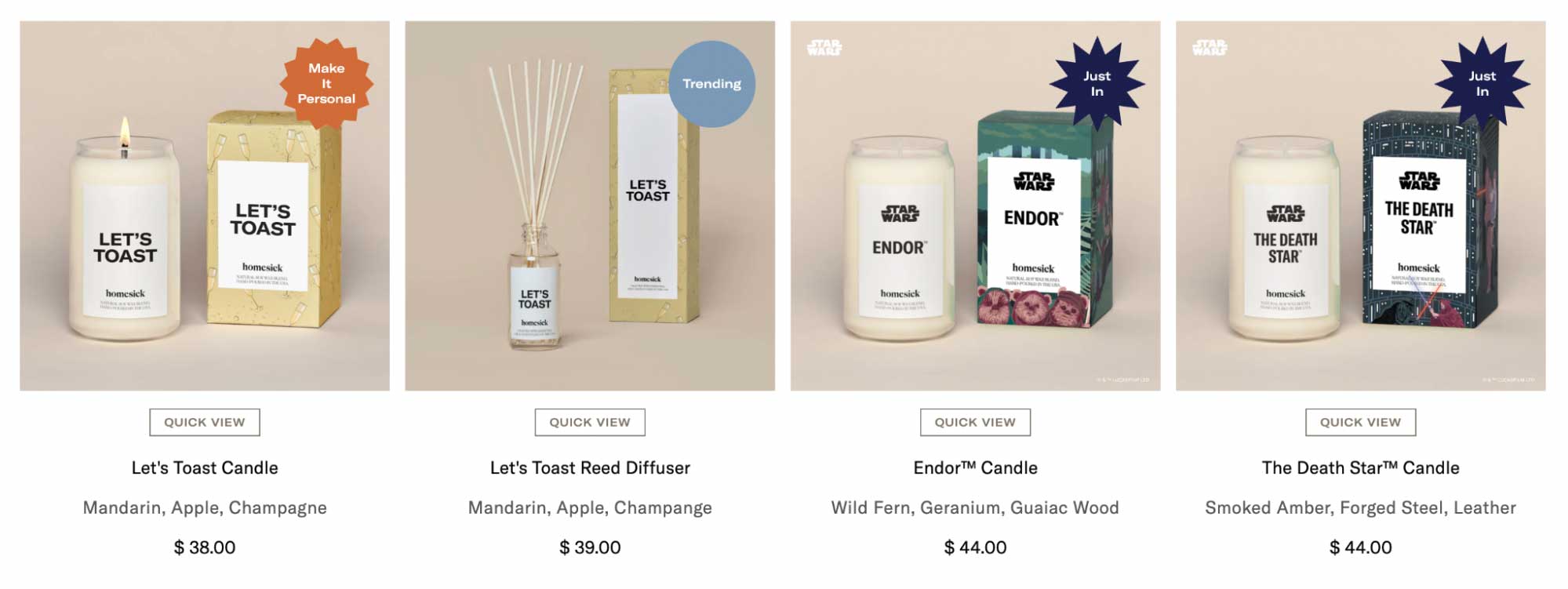
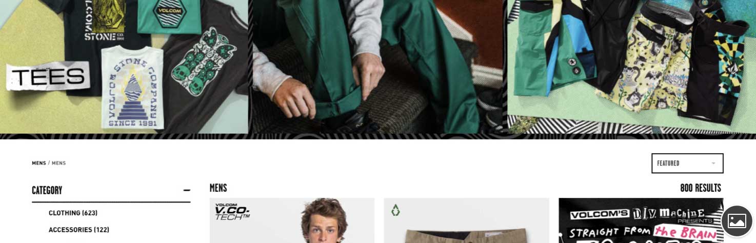
#1 - Should price appear on collection grids?
Where you place pricing on your store can impact customer experience and conversions. One which is worth testing, is whether or not you should display the price on collection grids like so:
There are a lot of considerations and potential outcomes to including the price on the collection page or not.
Let’s say you don’t include them - the customer is going to see the product on the collection page, and make a value judgement there and then before they click on the page. They know in their heads how much they think that product may cost. If the actual price is lower than their expectations, it seems like a good deal and therefore they may be more likely to buy. On the other hand, that may also work against you and they perceive the value of the product as being much lower than the actual price. Once they head to the product page, it may come off as overpriced.
Alternatively, including them may help to set expectations and reduce the number of customers landing on product pages who won’t ever make a purchase due to price. Every customer who lands on a product page is doing so being fully aware of the cost, and wants to know more.
You want to be able to better understand the behaviors of your customers when you do or do not include pricing on the collection page. When we ran tests, including the price increased revenue per session by about 23.6% with 97% confidence.
If you wanted a short answer to “is it worth including price on collection pages?”, it would be “maybe”. Which is precisely why you should test for your own store, rather than simply looking at someone else’s results and taking them as a best practice.
#2 - Is font size important? (spoiler: it’s more than font size)
Font size is something that commonly comes with UX and UI, however it’s just one piece of a much bigger, more important puzzle called readability. I’ve attempted to split test just font size, and couldn’t get anything conclusive or statistically significant, which goes to show you can’t reduce readability to something so specific as font size.
Baymard Institute regularly conducts large-scale usability studies, and through these we learn a lot about readability and guidelines around it. According to them, line length is actually the most important factor, rather than font size. There’s also color and contrast - if you’ve ever seen bright red text on black or something equally as painful on the eyes, you’ll know how important this is. There’s how large paragraphs are, how easy it is to click on different page elements, how easily understandable your language is. And there’s also font size.
#3 - Are hero images on collection pages worthwhile?
So, here’s the thing - hero images on collection pages look really smart. With a lot of design elements of your store, a huge part of the decision making focuses on the aesthetics and what looks good just by nature of what web design is.
However, in split test we ran for a store, getting rid of the hero image on the collection page increased revenue per session by 16% with 92% confidence. Even after running the test again on mobile versus desktop, new versus returning visitors, the numbers changed a little but in all cases it was always better without the hero image.
I’ve used hero images as a way to illustrate that you should test these design elements that you subjectively think look really good but may actually have a somewhat negative impact. Testing design elements is always going to be worthwhile. Just because it looks good, doesn’t mean it’s the best decision for your store.
#4 - Is free shipping a must have?
As we approach the holiday season especially, shipping becomes a hot topic for ecommerce. With brick-and-mortar stores, you can just physically go to the store and buy something the same day. Whereas with buying online, you need to rely on shipping and for some customers this can make or break their decision to purchase. To remedy this, many merchants turn to free shipping.
But how do you choose your threshold for free shipping? $25? $100? Or across all your orders as standard? You need to find the balance between what’s actually going to entice customers, and what makes sense for your profits. After all, you may think initially you need to offer it on all orders with no threshold, but through split testing you notice that there’s actually relatively similar pickup on free shipping when the threshold is $25. Maybe instead of just free shipping or $10 shipping, you add in a “budget” option that’s faster than free, but slower than express, to see if customers would rather pay for a slightly better shipping experience.
This is going to be a big one you need to test before BFCM and the holidays where fulfillment and post-purchase is even more crucial than the rest of the year. People know from watching the news when there are delays and supply chain issues. It’s more important to them that they know their order will absolutely arrive, rather than they save a bit of money in shipping costs. The idea that free shipping is the must-have, especially around the holidays, is no longer the case. It’s still important, but you can experiment with the threshold to find a balance where it works for your bottom line, and actually drives sales. You need to figure out what’s going to work best for your customers.
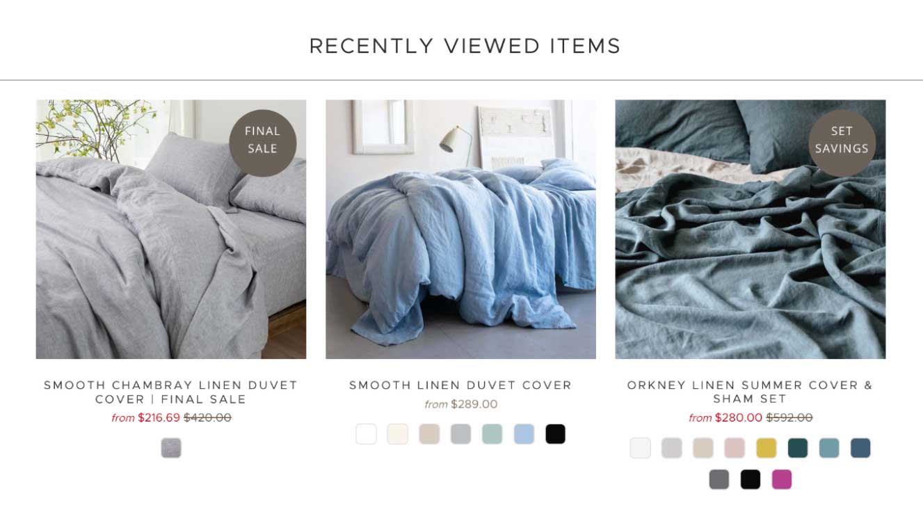
#5 - Should you always include a “recently viewed products” section?
We’ve all seen this section on so many ecommerce websites. You’re browsing a store, viewing lots of different products, trying to decide which to buy. You want to easily get back to that product you viewed a few pages earlier, and there it is handily on the page in the “recently viewed products” section. Maybe you go to your cart and you spot a product in that section on the cart page that you’d forgotten about and decide to add it. In theory, this keeps people on your store, and it helps to capture their attention and increase average order value.
But does the theory hold up? Kind of, but maybe not in quite the way you might expect.
We tested for this, and it did have a positive result overall. Great! That means it’s worthwhile, right? Well, we decided to segment it with new and returning customers. We reckoned that maybe this result would look very different for each segment, because if you’re a new customer then “recently viewed products” may be less important to you. Whereas if you’re a returning customer, it’s more relevant to you.
In our test, including this section decreased the conversion rate by around 9% for new visitors. For returning visitors, it increased by 33%. That’s a big difference. So, therein lies an opportunity to personalize the user experience; hiding the widget for new visitors, and leaving it be for returning visitors.
Personalization is huge in ecommerce, and it’s why it’s so important that when you’re split testing you’re also thinking about segmentation. Doing so will reveal any opportunities you may not initially realize to enhance customer experience and boost conversions.
——
Split testing is the key that’s going to unlock so many more sales and opportunities for your store. We’re seeing now channels like Facebook ads are less effective, and the more channels are changing the less clear it is which acquisition channels are actually worthwhile. So, an effective way to decrease costs and reliance on these other channels is to find the opportunities that may be lying in wait on your own site.
Run the tests, find the gold, and set your store up for success this holiday season.