Shopify Expert Insights

E-Com Advice from our experienced in-house team


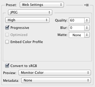
When saving images for the web, we need to strike a balance between file size and quality. For most images, the above settings when used in Adobe Photoshop CS5 will yield excellent quality within minimal file sizes. If you select "optimized" you may get a slightly smaller file size. Resist the temptation. We know that progressive JPEGs (while bigger) will appear to load faster to the user.
What features in Photoshop CS6 matter most to web designers? We downloaded the CS6 beta to find out. In addition to improved performance and a sleek new UI, we found some other gems in the CS6's list of 65 new features.

The new eyedropper shows a sample size popup. We've been using a 3rd party eyedropper in CS5 for this.

Delete a layer effect instead of just disabling it, no more messy layer styles from experimenting.

New document presets for common devices such as iPhone and iPad.

Automatic saving for crash recovery. This alone may be worth the upgrade in potentially saved time.

Insert "lorem ipsum" filler text in type.

CS6 feels like a huge leap forward. It's a far larger improvement than any previous iteration of Photoshop. If you can afford its unchanged price of $699, we strongly recommend it.

You can download the beta from Adobe Labs today.
You're receiving 300 unique visitor per day who view an average of six products per visit, but 99% of them never make it through your shopping cart. Sound familiar? It should.

Most ecommerce sites have their visitors abandon after viewing their shopping cart. According to Fireclick / DigitalRiver the average abaondment rate is 72.31%. A typical ecommerce site is losing thousands of customers by not optimizing their cart. Fortunately, shopping cart abandonment rates are easily corrected with a few basic usability improvements.

Less is More

Each additional step (even if you think its necessary) will increase attrition. Is all the information you collect absolutely required? Since removing form fields and steps is the easiest thing from a development standpoint, we recommend starting here. For example, if you don't ship internationally, why bother asking what country the customer is from at all? Are title, gender, birthday necessary fields? Of course not. Keep it simple to keep it successful.

Progress Indicators

Both on and offline, uncertainty results in consumer paralysis. It's easy to imagine when you consider some real-world examples. Best Buy transitioned to a single line for all of their cashiers rather than having customers pick a cashier like in a grocery store. Why? Uncertainty hurts conversion rates. As people, we are stressed by uncertainty. Online, we can reduce uncertainty by including a progress indicator for each step of the checkout process. Whether your checkout process is two steps or ten, indicating to customers where they are in that process will add certain and reduce cart abandonments.

A Picture Is Worth a Thousand Words

In the brick and mortar world, customers can pick up items from a shelf and inspect them. The online response to this is through photos. More photos, and bigger photos is absolute critical. Including thumbnails in the shopping cart as a visual cue will further reduce abandonments. This eases the customer's anxiety that they may have added the wrong item to their cart. Without the thumbnail, the customer will have to return to the product page and possibly re-add their item in the cart. Including a thumbnail prevents this redundancy.

Estimate Total Cost Early

Online shippers are wary of taxes and shipping. Maybe its from years of infomercials selling products for "Just $19.95 plus $19.95 shipping and handling." Regardless, you can ease the fears of hidden costs by including an estimated total in your the shopping cart. Even better, if your niche allows free shipping or flat rate shipping, you will not only have simplified the shopping experience, but you'll also gain a marketing advantage.
In 2010, mobile websites were a luxury. In 2012, they are a necessity. Here's why:

  • 63% of US smartphone owners make purchases on their smartphones at least monthly [Source]
  • Smartphone owners outnumber standard phone devices [Source]
  • Presently HTML5 "can do 95 percent of what we want” [versus native apps] says Thom Cummings of Soundcloud [Source]
  • Online shopping spiked 16.4% last Christmas day with 7% of purchases made on iPads [Source]
  • iPad and iPhone shoppers account for 90% of all mobile purchases [Source]
  • Gap Inc. cites mobile shopping as a major reason why it has tripled its online conversions in the last year. [Source]
  • eBay mobile sales grew from $600 million in 2009 to $4 billion in 2011 [Source, Source]

Invest in tomorrow.
I read the NYTimes piece "How Companies Learn Your Secrets" and was fasincated by people's reactions to Targets data mining practices. In our experience, businesses have the best intentions. They want to provide the best experience for their customers, and they dont want to risk annoying people through irrelevant advertising.

Data mining lets businesses effectively target tailored ads to highly specific audiences. Where people become wary is when they realize that information is being used that they never explicitly told the advertiser. If I give an advertiser information about me, its as if Im opting-in to the advertising and that gives me a sense of control. When I dont know the source of an advertisers information about me, its an eerie feeling. Even if they just extrapolated the information based on people like me, so long as it was an accurate assumption, it will appear to me as an invasion of privacy. The difference between "helpful" and "creepy" in advertising is choice.

One way to not be creepy is to be very transparent about your practices. Targets stone-walling of the NYTimes reporter isnt transparent. If people understood that targeted marketing is about statistical probabilities, and not someone poking around in their garbage cans at night, then they may feel differently. In this case, transparency is the difference between looking like a statistician and looking like a stalker.
Our own lead developer, Paul Reda, recently had success "going viral." On Thursday, he uploaded a timeline biography of 1900's  Chicago private investigator Cora M. Strayer. By Friday it had received over 4,000 unique visitors.

How and why did Paul's Cora Strayer piece go viral? The initial promotion was simple, Paul tweeted to his 145 followers: "So over the [weekend] I researched the life of a woman who was a PI on the South Side in the early 1900s. She was awesome." And then fizzled out. It retweeted only eight times. One of those people did think it interesting enough to submit it to weblog BoingBoing.

That evening, Boing Boing published the article, calling it "a fascinating, and often tragic, timeline of extraordinary adventures." From there it spread to link aggregation site Reddit, and community blog Metafilter. Combined with sporadic blog referrals, it received an additional 2,000 views over the weekend.

It is interesting to note that the article itself was posted as a static webpage, and featured no social or interactive features at all. It was an incredibly simple execution. Its merit was entirely in its written content, not any gimmick.

Paul's Cora Strayer article went viral because it's an interesting story. It's historical truth with some salacious implications, and it had never been told before. People who read it were intrigued, and wanted to share that feeling with others. That's the core of why anything goes viral. It makes us feel something that we want others to feel too.

The inconvenient truth is that there's no way to predict what will go viral, and no way to make something go viral. In this instance, it took unique and engaging content, and a day's worth of work. There is never going to be easy way to do that.
I used to find Quality Scores on Google AdWords very frustrating. They never seemed to make sense. I got so frustrated that I suspended my Google AdWords campaign. When I did this, my AdWords rep called me up and tried to get me to spend my $10k budget again. I refused unless the rep taught me how to achieve high quality scores. Based on that information, and with some experimenting, I came up with a system that always works.

  1. Make a new ad group. Quality scores are historic, you must do this if you have a low score.

  2. Choose one phrase or exact match keyword.

  3. Use that keyword as the first part of your ad headline.

  4. Create a landing page using your keyword as the title.

  5. Wait three days for your click-through rates to be established before adjusting.


You'll start with a quality score of 7 like this. Over time, if you have a good click-through rate, and a low bounce rate, the quality score will go up.