Shopify Expert Insights

E-Com Advice from our experienced in-house team

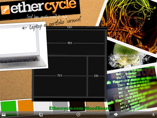
Mood boards serve as a visual tool to quickly inform others of the overall feel that a designer is trying to achieve. We find them to be most helpful as a source of inspiration. A typical mood board can feature color palettes, logos, concepts, ideas, features, layouts, pictures, screen shots, and anything else that can be informative or inspirational to the project's team.
Sample mood board for EtherCycle.com.
While different clients and projects require unique design and development processes, a typical EtherCycle website is created in the following order:
  1. A consultation assesses your needs, aims, and budget.
  2. A proposal is created to establish the project's budget, goals, and timeline.
  3. A type of poster design called a mood board is created to develop our design concepts and to communicate to other members of the design team.
  4. Mockups of the home page are created.
  5. Mockups of the internal pages are created.
  6. Content is supplied or created as necessary.
  7. Development begins.
  8. Usability testing ensures the website is easy to use.
  9. Cross-browser compatibility testing allows for thorough debugging.
  10. Meta Tags are created based on market analysis.
  11. The site is live, Champagne is enjoyed.
This is definitely an oversimplification of what occurs, but to those of you who are new to the process, it may be helpful. It's also important to note that the client is included in every step, and if anything is not to their satisfaction, that step is repeated. Typically, the home page mockup (step3) is repeated several times to achieve the client's vision. To date, the development process has never had to be repeated as our sites have always exceeded our client's expectations.
Section508 is an amendment to Workforce Rehabilitation Act. It's a provision assures that people with disabilities can access web pages predominately through the use of text labels and descriptors for graphics. It applies to all Federal agencies, and sometimes private organizations who receive Federal funding. EtherCycle understands the fourteen guidelines for better web content accessibility set forth by The World Wide Web Consortium.
Search Engine Optimization (SEO) is the art of coaxing search engines in to driving traffic for specific keywords to a particular website. There are two approaches. Paid or organic inclusion. Paid SEO is the most straight-forward method, as a webmaster pays for traffic in the form of advertising. By buying Google AdWords or paying for banner ads, traffic is driven to their site. While anyone can buy ads, the trick is to maximize the efficiency of these ad campaigns by carefully controlling placement so that each click paid for is actually within the target market. With some AdWords campaigns exceeding $100k monthly, it is self-evident why a campaign manager is necessary to ensure the efficacy of each paid click. Organic or natural SEO strategy is a multi-faceted discipline that seeks to place a website as high as possible in search rankings for relevant keywords. Content strategy, link building, accessibility, and competitor analysis are the corner stones of any good organic SEO plan. Organic search engine marketing is critical to the success of any online business. All of our websites are designed in such a way to be easily and completely read and indexed by search engines. This guarantees that our clients' customers can easily find them. Additionally, employing organic SEO strategy from the ground-up has the added benefit of improving accessibility, increasing the base of users who can view our designs.
or "Why Users Are Leaving Your Website" Regardless of its style or category, any website's success hinges on its ease of use. According to Jakob Nielsen, an eminent usability expert, "If a website is difficult to use, people leave." A website should:
  • State plainly what it offers.
  • Be easy to navigate.
  • Be easy to read.
  • Offer answers to user's questions.
  • Load quickly and consistently on a variety of browsers and devices.
Since there is no standard on how websites should be designed, it's up to the web design agency to infer what users will expect given a client's particular content. Through experience and testing, the agency can determine the best design, all while maintaining the brand's message. A good web design agency should be spending 10% of a project's budget on usability testing. Nearly universally users assume that:
  • A link to the home page, usually in the form of a logo, is available in the upper left.
  • Pages have descriptive headers or titles announcing which page a user is on.
  • Text is legible. Printed in high contrast, appropriately sized, and carefully typeset.
  • Load times will be short, or a progress bar will indicate loading if necessary.
  • Navigation is placed near the logo, either at the top of a page or down the left side.
To aid ease of use, a designer should:
  • Avoid drop-downs or other expanding menus (with the exception of large fly-outs.)
  • Use modal windows where applicable to prevent unnecessary page changes.
  • Use breadcrumb trails make large websites easy to understand. For example, a listing on eBay for a truck wheel would include the following note near the top: "eBay Motors > Parts & Accessories > Car & Truck Parts > Wheels, Tires & Parts > Wheels"
  • Offer a search tool, preferably located in the upper right, for users to quickly navigate large sites.
  • Use style-based elements, optimized images, and minified code to reduce load times.
By designing a site with usability in mind, the user's experience with a brand is greatly improved. The user will have more confidence in the brand, and be willing to spend more time on their site, which translates into increased sales.
The power of Firefox is in its library of add-ons. There are at least five extensions that a web developer can not live with out.
  1. FireBug "Put a wealth of development tools at your fingertips while you browse. You can edit, debug, and monitor CSS, HTML, and JavaScript live in any web page."
  2. MeasureIt "Users can calculate the measurement specifications of tables, paragraphs on internet."
  3. ColorZilla "Advanced Eyedropper, Color Picker, Palette Viewer and other colorful goodies."
  4. ScreenGrab "Save or copy the current page, viewport or selection in a png file."
  5. Load Time Analyzer "Measure and graph how long web pages take to load."
There are two major components to a web page's code. The top or Head, is the machine readable portion of the page that provides additional information called Meta tags to search engines. The rest of the page, or the body is the part seen by us humans. The importance of meta tags is often overstated when optimizing a website for search engines. As a result, there are a lot of myths regarding meta tags. Below are five important meta tags truths.
  1. Google has ignored the keywords meta tag for years. It's possible that Google could use this information in the future, but it's unlikely.
  2. The title tag is the new keywords tag. Bing and Google both consider a page's title to be its primary keywords.
  3. The description tag is often (but not always) used as the snippet shown in a search. It will not impact your ranking in Google's search results.
  4. Most new meta tags are proprietary tags used by one or two third search engines. We've even seen cases where a meta tag was invented on the spot by a developer. This is not helpful in anyway.
  5. Bing relies on geo-meta tags to determine a site's location, but Google ignores them because they're too often improperly implemented.
All of our websites include complete meta tag information because it is helpful, but we never charge our clients for keyword stuffing disguised as Search Engine Marketing. Google's Matt Cutts states that, "Lots of webmaster just copy/paste from a template without checking the meta tag values. The unreliability of the meta tags is why Google tends not to use them or give them less weight."
It is no longer good enough to just have a website to set yourself apart from your competitors. A professional design is more important than ever, but how do you choose a designer? By making the following five observations, you can choose the designer who's right for you.
  1. Proven Portfolio Any competent web design agency should have a portfolio of exemplary web sites to demonstrate what they're capable of doing. It should be freely available on their website, but if not, ask.
  2. Standards Compliance Does your website work on all major browsers? Do you know? A competent web developer is versed on the inconsistencies of various browsers and operating systems, and is able to compensate for them appropriately. Ask your agency about their "Cross-browser compatibility testing."
  3. What You See is What You Get What is the agency's website like? Often an agency's website is a strong indication of the sites they design. If you don't like their website's style, you probably won't like their proposals.
  4. Listening skills. Web design is a service industry. The client should tell the agency what they want, not the other way around. If you're web designer is pushing you to use a particular design that you're not comfortable with, it may be because it's easier for them. A good web design agency will listen to their client's needs.
  5. Price indicates skill. While you could accept the lowest bid from a student on summer break, you will likely get what you pay for. If you're serious about your business, it would be best to take advantage of an experienced web design agency.
The average website takes 4-7 weeks to complete. Afterward, your new website will need continued maintenance throughout its lifetime. For these reasons, your relationship with your web designer should be a partnership.
The goal of any design is to effectively communicate a message. Typically this means promoting a brand or selling a product.
  1. Less is more. Every element added to a design increases cognitive dissonance, meaning that it makes the site's message more difficult for the customer to find. It will take some constraint, but I promise that less is more when communicating a brand message.
  2. Color Palette Consistency of message is important and that includes colors. If you have a set of official colors, those should be the colors used in your website. Ideally those same colors will be used on every page. A constantly changing color selection implies haphazard organization, while a consistent color scheme looks professional.
  3. Typography With the huge selection of fonts freely available online, it's tempting to use a different font for every element of your design. Like your color palette, it's important to choose two or three fonts at most and stick with them throughout your marketing materials.
  4. Photos Photos are fantastic to connect with your customers, but they're also the most obvious indicator of your professionalism. A stock photo from the Web or your Uncle's point and shoot camera will immediately cheapen your brand's integrity. With photos, more than anything else, it's important to use exclusively professional photos to flatter your brand and products.
  5. Social Media Circus While social media is important, its significance is often overstated. What is important is to be accessible to your customers. Before signing up for that shiny new web2.0 service, ask yourself how it will help your business. Does it make me more accessible to my customers? Do I have to manage it daily? If you can't check a service daily, people who use it to contact you will be frustrated. Choose your social media wisely or hire a social media manager.
Typefaces are important because they determine, on the most fundamental level, how easy it is to read a document. (And after all, all web pages are documents.) At the same time, typefaces determine perception. They should reflect and reinforce the mood of their content. Most importantly, your font must legible. Some fonts (like the eponymous Bleeding Cowboys) is intended specifically for logos or headings, and would be totally inappropriate for anything longer than eight words. By choosing a font that is easy on the eyes, you improve your site's usability and accessibility. The typeface that you select needs to accurately reflect the mood of your message. Always consider the audience for which the piece is intended, and then choose a font that achieves your desired perception. For example, a sans-serif modernist font like Helvetica is the font of choice for Apple because it mimics the clean industrial design their customers know and love.