Let us show you proven strategies to optimize your Shopify business:
The Unofficial Shopify Podcast & More

From College Dorm to 750 Stores: The Happy Habitats Story
“There were three or four years straight where we were like, if it doesn't go the way we need it to go,
we'll close it down at the end of the year -- and then year end comes and we're...
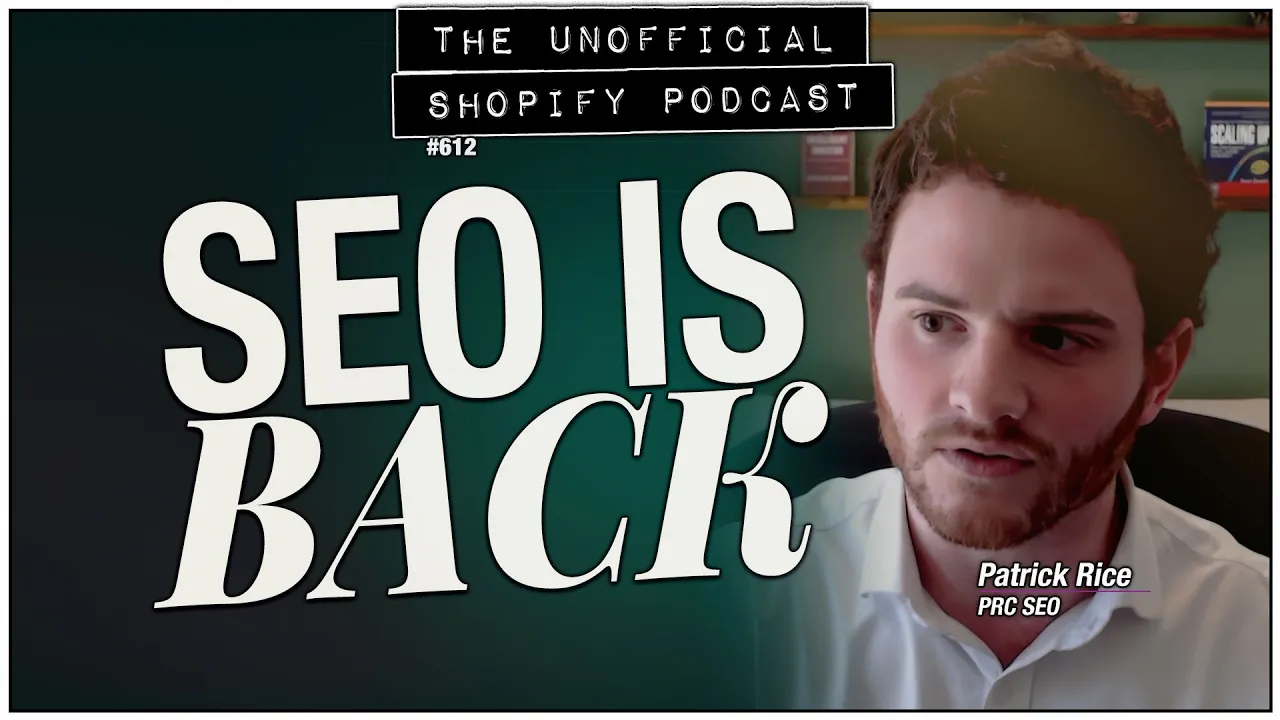
How to Get ChatGPT to Recommend YOUR Shopify Store: AEO
"I think this is a revival of SEO, a little bit of a resurrection."
SEO expert Patrick Rice is back, and this time he brought receipts. His agency got a Shopify brand
to show up in ChatGPT recom...

The Shopify Product Network Explained
“We are actually giving you money to acquire a buyer, which is a complete flip of the narrative.”
Amanda Engelman is the Director of Product at Shopify leading advertising and ch...
The Unofficial Shopify Podcast
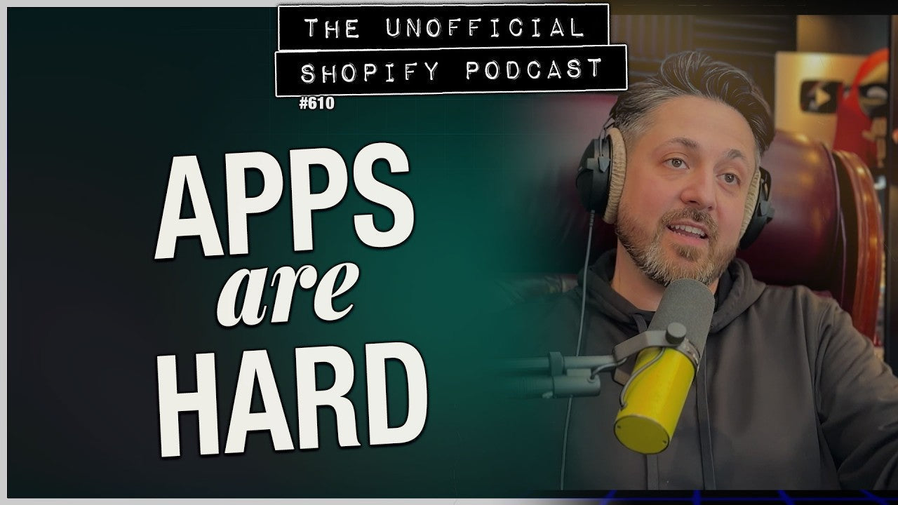
We Built a "Simple" Shopify App. It Took Over a Year.
Join Kurt, Karl, and Paul as they share the epic year-long journey of building the Shopify app Promo Party Pro and the challenges faced.
The Unofficial Shopify Podcast
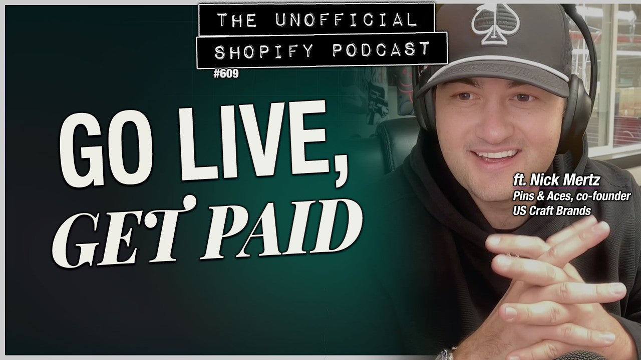
From Golf Head Covers to $25M Empire: Pins & Aces Story
Discover how Nick Mertz turned $6,000 into a $25M golf empire with innovative strategies like live selling and licensing deals.
The Unofficial Shopify Podcast
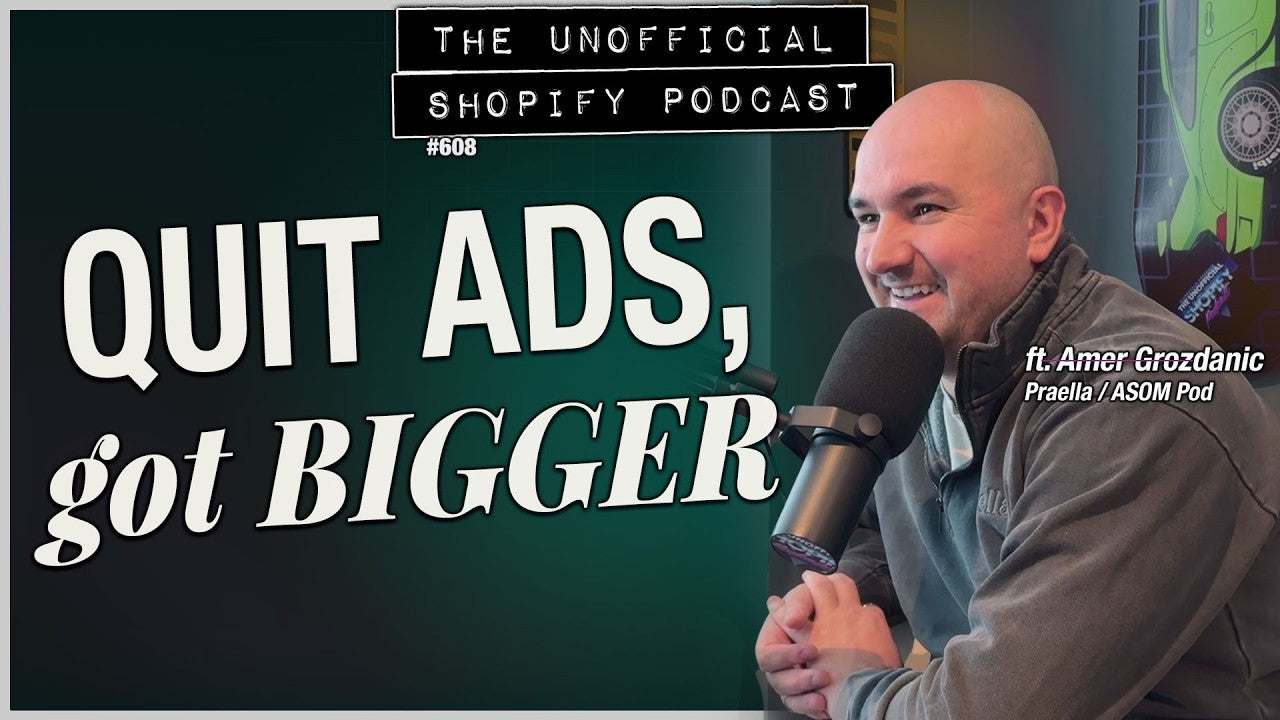
This Shopify Agency Quit Paid Media (And Got Bigger)
Discover how Amer Grozdanic's agency thrived after quitting paid media and focusing on Shopify features that drive real results.
The Unofficial Shopify Podcast
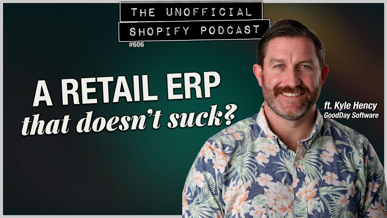
ERP Explained: What They Are, When You Need One, Why They Don't Have to Suck
Discover how ERPs can transform your DTC brand's operations without the usual headaches, featuring insights from Kyle Hency of GoodDay Softw
The Unofficial Shopify Podcast
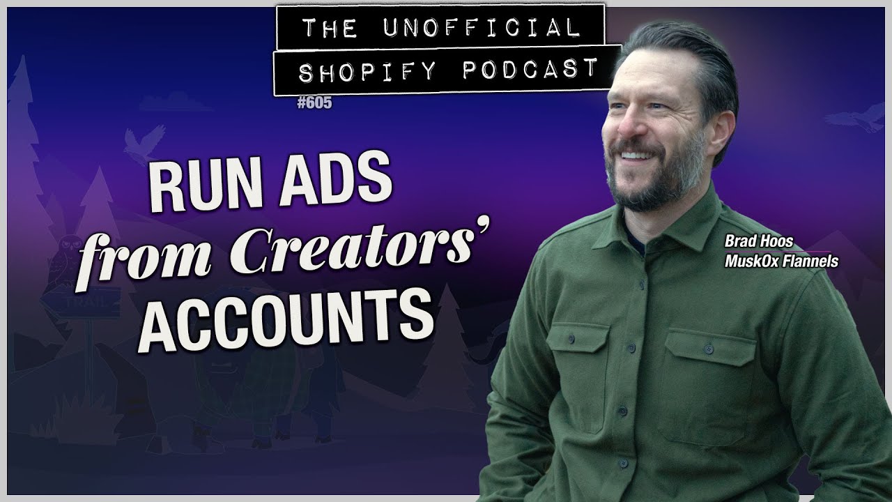
Influencer Whitelisting: What It Is & How to Start
Discover how influencer whitelisting can boost your ad conversions by 15% and learn the essential steps to get started.
The Unofficial Shopify Podcast
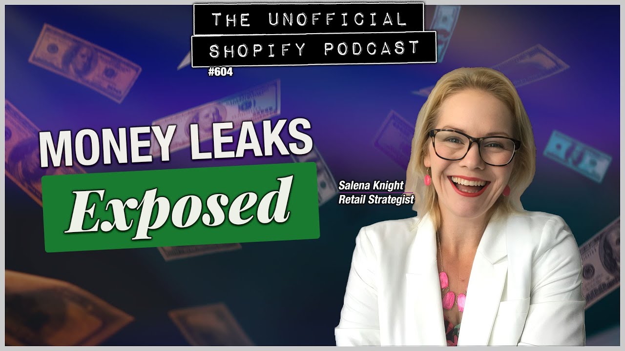
Why 7-Figure Stores Have No Cash | Salena Knight
Discover why 7-figure stores often struggle with cash flow and learn how to identify hidden money leaks in your business.
The Unofficial Shopify Podcast
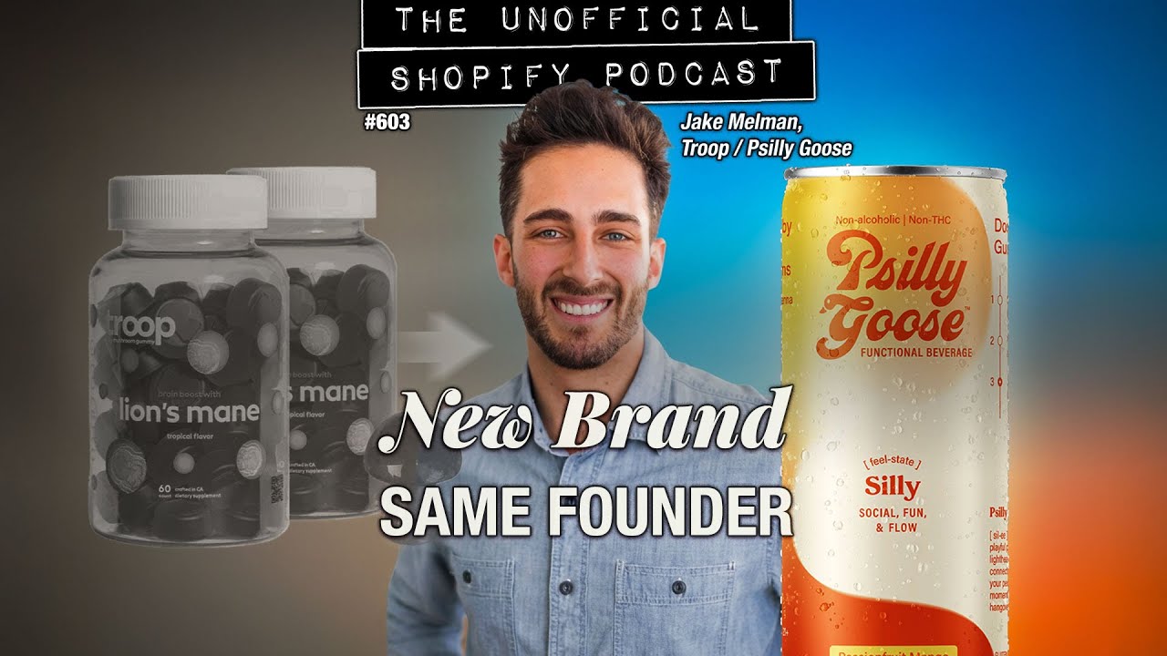
Building Psilly Goose: A Mushroom Brand's Bet Against Booze
Discover how Jake Mellman is redefining alcohol alternatives with Psilly Goose, a THC-infused beverage, and his journey with Troop.
The Unofficial Shopify Podcast
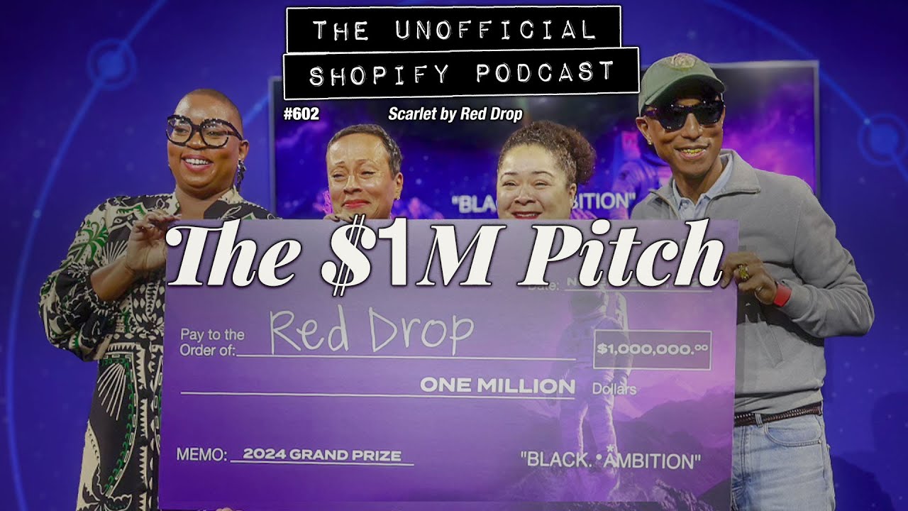
The Period Brand That Won $1.5M Pitching: Scarlet by RedDrop
Discover how Scarlet by RedDrop transformed period care for young girls and won $1.5M in funding through innovative pitches.
The Unofficial Shopify Podcast
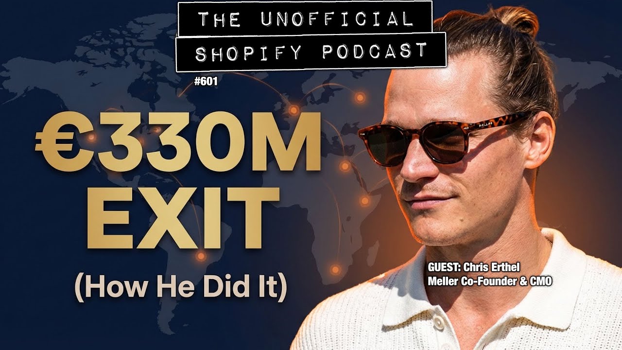
The €330M Exit Behind Meller's Global Sunglass Empire: Chris Erthel
Discover how Chris Erthel scaled Meller sunglasses and navigated European markets for ecommerce success.
The Unofficial Shopify Podcast
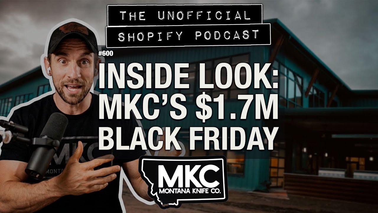
Inside Montana Knife Company's Black Friday 2025
Discover how Montana Knife Company achieved $1.7M in Black Friday sales without discounts by targeting customer personas.
The Unofficial Shopify Podcast
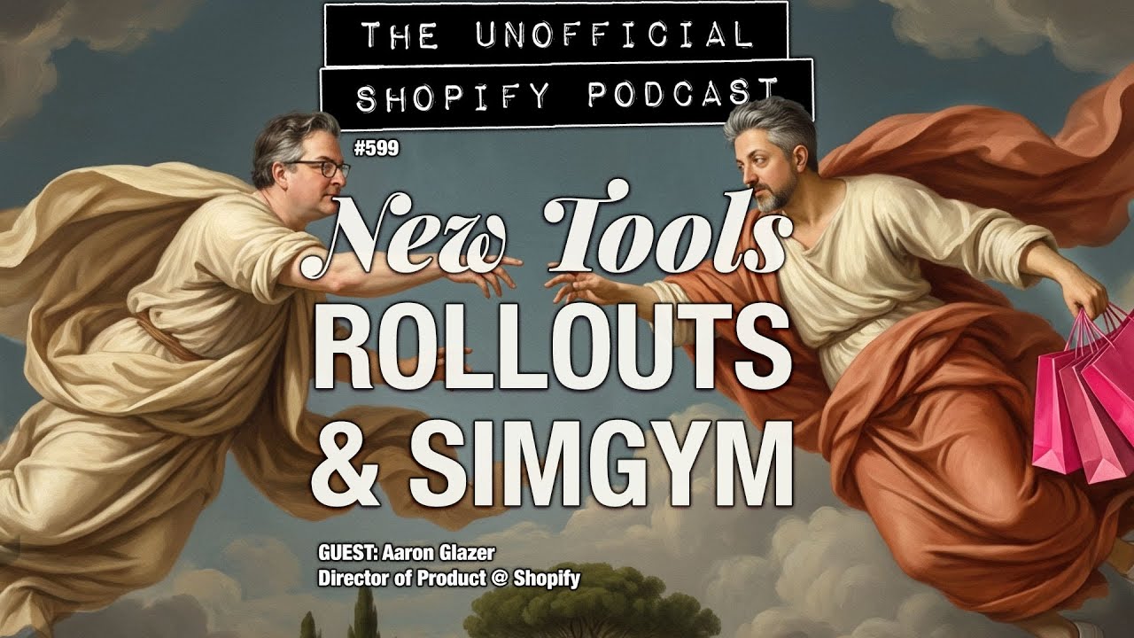
Native A/B Testing Hits Shopify: Rollouts & SimGym Explained
Discover how Shopify's new Native A/B Testing features, Rollouts and SimGym, can enhance your ecommerce strategy.
The Unofficial Shopify Podcast
Shopify Editions Winter '26: What Matters
Discover the key updates from Shopify's Winter '26 Edition that matter most for store owners and how to leverage them for success.
The Unofficial Shopify Podcast
Why Your Creative Strategy Is Burning Cash (w/ Nehal Kazim)
Nehal Kazim reveals why overproducing content is burning cash and shares a profitability-first framework for creative strategies.
The Unofficial Shopify Podcast
She Sold 250K Shampoo Bars Without Ads | Kate Assaraf, DIP Haircare
Discover how Kate Assaraf built a million-dollar shampoo bar business without ads or Amazon, defying industry norms.
The Unofficial Shopify Podcast
What Discounts Actually Make People Buy (Study)
Discover how discount strategies impact buyer behavior and learn what drives conversions for big brands versus small ones.
The Unofficial Shopify Podcast
This Founder Automated Influencer Outreach Completely
Discover how Bora Celik automated influencer outreach using AI agents and learn to build your own automation for ecommerce success.
The Unofficial Shopify Podcast
Buff Clucks: From Homework Assignment to 7-Figure Chicken Brand
Discover how a homework assignment transformed into Buff Clucks, a seven-figure chicken supplement brand in just 18 months.
The Unofficial Shopify Podcast
What's New in Shopify: November 2025 | 2048 Variant Limit
Shopify's variant limit has soared to 2,048! Discover the impact on themes, new features, and essential tips in this episode.
The Unofficial Shopify Podcast
Black Friday Starts Early: The 3-Week Email Strategy
Discover the email strategy that 8-figure brands use for Black Friday success in this episode of The Unofficial Shopify Podcast.
The Unofficial Shopify Podcast
What Accessibility Experts Actually Fix (4 Things) w/ Bet Hannon
Discover four key accessibility fixes for e-commerce stores with expert Bet Hannon and learn to reduce legal risks today.
The Unofficial Shopify Podcast
Inside Smart Marketer Live: What's Working in Meta Ads NOW
Discover what's working in Meta ads today with insights from Smart Marketer Live. Get actionable strategies for your online store.