Shopify Expert Insights

E-Com Advice from our experienced in-house team

Part of our beginner's guide to WordPress.
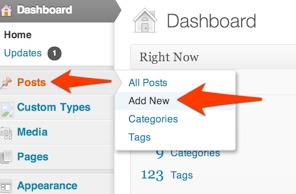
Adding an image

While adding or editing a post...

  1. Click the Add Media button.
  2. Select a photo from the previous uploaded under Media Library
  3. Or upload a photo from Upload files. Just drag & drop.
  4. Under Attachment Details in the right sidebar, enter a Caption. It will appear under the image.
  5. For improved SEO and better accessibility, write a short description of the image in Alt Text.
  6. Under Attachment Display Settings, you can set the image's alignment. If you set it to Left or Right, your article text should wrap around the image.
  7. Click the Insert into post button in the lower right.

Adding an image gallery

While adding or editing a post...

  1. Click the Add Media button.
  2. Click Create Gallery on the left side.
  3. If you have new photos, click Upload Files to add them. Otherwise...
  4. Select your photos from the Media Library
  5. Click Create a new gallery
  6. Drag and drop to reorder images.
  7. Click the caption below each image to edit it.
  8. Click Insert gallery in the lower right.

Editing an image

While in the Media Library...

  1. Select the image to be edited
  2. On the right sidebar, click Edit Image
  3. Click and drag across the image to make a selection. Click the crop icon in the upper left to crop to your selection.
  4. Click Save below the image

From our Beginner's Guide to WordPress.

Adding a new post

From dashboard...

  1. Click Posts
  2. Click Add new
  3. Enter a title. (SEO Tip: 70 characters max!)
  4. Past your article in to the Visual editor.
  5. Under Featured Image, click "Set featured image" to set the post's thumbnail. (This may also used when people share your article.)
  6. In Excerpt, enter a short summary of your post. It should be 140 characters, just like a tweet.
  7. In the right sidebar, under Categories, check which category the article belongs in. Pick one. (If you choose a subcategory, your post is automatically included in its parent category.)
  8. Under Tags, enter your tags, separated with a comma. WordPress will auto-suggest tags as you type.
  9. You're ready! Click Publish post.

Operating System

  1. 74.41% iOS
  2. 24.04% Android
  3. 0.74% BlackBerry
  4. 0.71% Windows Phone
  5. 0.04% SymbianOS
  6. 0.06% Other

Mobile Device

  1. 54.18% iPhone
  2. 17.32% iPad
  3. 2.78% iPod
  4. 1.56% Galaxy S III
  5. 1.33% Droid Razr 4G
  6. 1.23% Nexus
  7. 71.05% Galaxy S II
  8. 0.9% Galaxy Nexus
  9. 0.75% Nexus S

Viewport

  1. 43.52% 320x480
  2. 16.92% 768x1024
  3. 12.79% 320x56
  4. 85.82% 720x1280
  5. 2.77% 480x800
  6. 18.18% Other

Based on 553,967 visits to calmingmanatee.com during the month of January 2013. Of which, 28.15% of traffic was from a mobile device, a 5% increase over the previous month.

Compared with the overall internet population, the site's users tend to be under the age of 35, and they are disproportionately childless women browsing from school and work who have incomes between $30,000 and $60,000.

Let's say you want to load a background image for desktops, but not on smartphones.

You could conditionally load the background images on devices that are not smartphones. With a single media query.

1
2
3
4
5
6
body { background: #fefefe; }

/*  If not a smartphone, then load background image */
@media only screen and (min-width : 321px) {
html { background: url("bg.jpg") no-repeat center top; }
}

You could also change the width wider to account for devices in landscape mode.

To be the best designer possible, you must code.

Designers should code.
In the last year I have collaborated with other designers on a few projects. In two of those cases, the designs included elements that weren't reasonable for the web. It was immediately apparent that the designers' decisions were purely aesthetic, and not informed by web standards. I realized then that to be the best designer possible, you must code.

Design is multi-disciplinary
Designers will happily write, read, discuss, learn, and otherwise perform a myriad of tasks that bolster their designs. From related skills like color theory or typography, or more intellectual pursuits like information architecture, content strategy, or competitive research. Yet the moment someone says "code it," designers either panic or turn up their nose at the thought.

Design is not veneer.
How can anyone expect to design for a system they don't truly understand? Sure, you understand user behavior, but you don't understand the underpinnings of your design. Without considering the underlying code, you're just making a veneer, and counting on someone else to figure out the details for you. That's not teamwork, it's an assembly line.

Speak developers' language.
Developers are translators. It's their job to translate a design in to language that browsers can understand. Developers fully understand the customs and traditions of their people, the browsers. Have you ever said to a developer, "but can't you just..." and then have them look at you pitifully? Those conversations are frustrating for everyone involved because there's a language barrier. The best way to have productive conversations with developers is to learn to speak code. Once you've achieved a level of mutual understanding, you'll collaborate better than ever before.

Design with performance and mobile in mind.
By understanding best practices for performance and mobile, you'll make informed design choices from the start that result in sites that are both beautiful and functional. That means fewer revisions and happier clients.

Try it. No one will die.
I'm not saying that a designer should try and replace their developer. I am advocating that you, the designer, will be a better member of your team by learning to code. You'll build better user experiences. As a professional, that should be your ultimate goal.

Let's dispel a few mobile misperceptions.

"People only use mobile devices on the go."
People use their phones in a variety of contexts because it's always with them. They especially use them as a second screen when watching TV or even when using a tablet. Look to your own usage patterns.

"Hiding content provides an optimized experience."
No, it's just limiting. If I can view it on my desktop, why can't I view it on my phone? People want a full experience regardless of the device their using.

"Native experiences are best."
No single approach is right for every situation. The right approach is whichever can provide the most consistent user experience.

We visited CES in Vegas this week to see what new and exciting product launches and trends are on the horizon for 2013.

Some things we think are relevant to web designers:

  1. You thought retina displays were sharp? Wait until you see a 4K tablet. Everything is going to need to use vector graphics to support this inevitable leap in display resolutions.
  2. Smart TVs have been on the mass market for over a year, but this year they might actually be usable. Including media queries and reading consideration for televisions is going to be important.
  3. If you've got a SmartTV, you may soon have a smart home too. An increasing number of appliances had internet connectivity— we even saw a connected fork. Yes, the eating utensil. The "internet of things" paradigm continues, and that means content parity will continue to be important. Fortunately, if you're supporting things like semantic markup, open graph, and even RSS, you're already prepared for this.

Some glimpses from around the show:


Samsung had NFC displays on some of the machines at Caesar's. I feel like the same thing could be accomplished better with QR Codes.


Polaroid took a shotgun approach to their new product line, which even included a tablet.


Ever play Angry Birds on a 4K touchscreen? It seemed like touch-enabled devices outnumbered traditional displays.


The CubeX 3D Printer. The march toward desktop 3D printing continues, and we think it can't come soon enough.

Lastly, a note to manufacturers: Enough with the iPhone cases already. CES is 30% iPhone cases.

What devices should be optimizing for?

Operating System

  1. 78.85% iOS
  2. 19.60% Android
  3. 0.98% BlackBerry
  4. 0.47% Windows Phone
  5. 0.03% SymbianOS
  6. 0.07% Other

Mobile Device

  1. 61.72% Apple iPhone
  2. 14.24% Apple iPad
  3. 2.80% Apple iPod Touch
  4. 1.06% Motorola Droid Razr 4G
  5. <1% Samsung Galaxy S3
  6. <1% Samsung Galaxy Nexus
  7. <1% Google Nexus 7
  8. <1% Samsung Galaxy SII

Screen resolutions

  1. 53.23% 320x480
  2. 13.82% 768x1024
  3. 10.63% 320x568
  4. 4.18% 720x1280
  5. 2.45% 540x960

Based on 1,002,486 visits to calmingmanatee.com during the month of December 2012. Of which, 23.12% of traffic was from a mobile device.

Compared with the overall internet population, the site's users tend to be under the age of 35, and they are disproportionately childless women browsing from school and work who have incomes between $30,000 and $60,000.